This week’s post will mark the start of my experimentation with purrr and regular expressions (regex). I’ll also take a look at a package called skimr, which looks like a pretty efficient way to get a quick overview of our data.
In case you don’t know, purrr essentially abstracts away the need for many kinds of for loops used to iterate over lists or atomic vectors. As Hadley writes in R for Data Science, the apply family of functions solve a similar problem, but purrr provides a more consistent and easier-to-learn approach.
So, the goal for the next few weeks is to try to use a couple of different functions from the purrr package every time I write a post. There’s a nice list of purrr resources here. Whenever possible, I’ll also try to make use of regexes in the data wrangling process.
Housing Price Index data
This week we’ll take a look at the Housing Price Index data set provided by Freddie Mac, which
is a broad measure of the movement of single-family house prices. The HPI is a weighted, repeat-sales index, meaning that it measures average price changes in repeat sales or refinancings on the same properties.
We’ll also take a look at the accompanying mortgage rates and recession data. We’ll use the map function from purrr in conjunction with skim from skimr to concisely write code that lets us get an overview of many data sets simultaneously.
# Loading useful packages
library(tidyverse)
library(lubridate)
library(skimr)

PATH <- "~/Documents/GitHub/tidytuesday/data/2019/2019-02-05"
files <- list.files(path = PATH, pattern = "*.csv")
data <- map(file.path(PATH, files), read_csv)

# Data
mortgages <- data[[1]]
recessions <- data[[2]]
hpi_index <- data[[3]]
map applies a function to every element of a list or a vector and returns a list. In the preceding chunk I’ve mapped the function read_csv to every element of the vector files, which (after appended to PATH with the file.path function) contains the paths to this week’s data. The result is a list where each element is a tibble.
Skimming the data
There are many different kinds of map functions in purrr. One that seems particularly useful is map_if, which applies a function to every element of a list or a vector if some condition is met. So, for example, skim won’t work if a data set is empty. To make sure that skim is only mapped to appropriate data sets, we can use map_if to make sure that it is applied only to tibbles that contain one or more rows:
# Previewing data using purrr and skimr
map_if(data, ~ nrow(.x) > 0, skim)
The Markdown output in blogdown is kind of messy, so the following is what you would see in your console if you ran the chunk above:
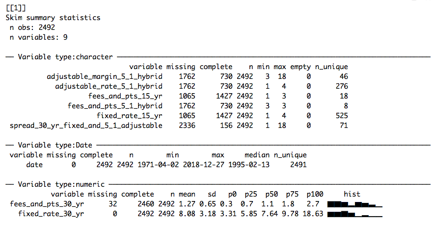
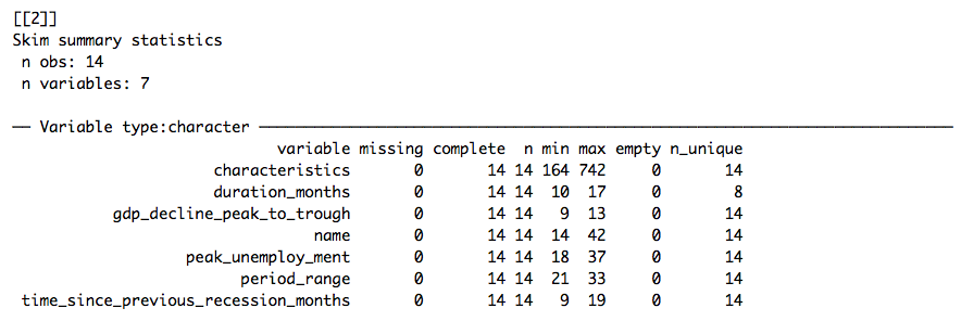
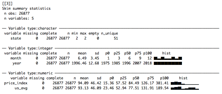
I think this is really cool. As you can see, skimr groups our data by variable type and summarises them accordingly. One line of code gives us an overview of three different data sets (corresponding to the elements of files), allowing us to diagnose problems pretty quickly. For instance, it’s clear that the character variables in our first data set (mortgage.csv) probably should be numerics. mutate_at lets us apply as.numeric to several columns:
mortgages_fixed <- mortgages %>%
  mutate_at(vars(-date, -fixed_rate_30_yr, -fees_and_pts_30_yr), as.numeric)
Let’s skim the data again:
mortgages_fixed %>%
  skim()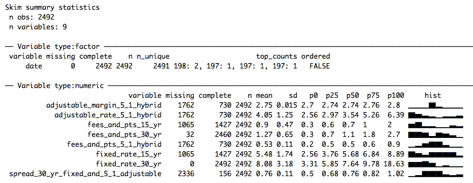
Much better!
Regex and recessions
I’d like to try to make some interesting visualisations of the price index and recession data. Clearly, recessions needs some work:
recessions %>%
  select(name, period_range) %>%
  knitr::kable() %>%
kableExtra::kable_styling(bootstrap_options = c("condensed", "striped"))| name | period_range |
|---|---|
| Great Depression | Aug 1929-Mar 1933ct 1929-Dec 1941 |
| Recession of 1937–1938 | 1937May 1937-June 1938 |
| Recession of 1945 | 1945Feb 1945-Oct 1945 |
| Recession of 1949 | 1948Nov 1948-Oct 1949 |
| Recession of 1953 | 1953July 1953-May 1954 |
| Recession of 1958 | 1957Aug 1957-April 1958 |
| Recession of 1960–61 | 1960Apr 1960-Feb 1961 |
| Recession of 1969–70 | 1969Dec 1969-Nov 1970 |
| 1973–75 recession | 1973Nov 1973-Mar 1975 |
| 1980 recession | 1980Jan 1980-July 1980 |
| 1981–1982 recession | 1981July 1981-Nov 1982 |
| Early 1990s recession in the United States | 1990July 1990-Mar 1991 |
| Early 2000s recession | 2001Mar 2001-Nov 2001 |
| Great Recession | 2007Dec 2007-June 2009[69][70] |
I’d like to retain the name and period columns of recessions, because I’d like to use geom_rect to visualise the periods when plotting our time series. We see that each row in period has a relevant interval of the format [Month abbreviation Year]-[Month abbreviation Year]. We can use regexes to extract these.
I didn’t really know anything about regexes prior to writing this post, so a small disclaimer is appropriate before we move on: This isn’t meant to be a regex tutorial, for that I would advise you to start with the resources listed below and google your way from there.
- The strings chapter of R for Data Science
- Regex crosswords
I particularly recommend the regex crosswords. They really force you to think about what’s happening. I used this online regex tester to check my reasoning, but was recently made aware of a similar functionality in RStudio:
Our @rstudio add-in of the day: https://t.co/dnt9gmsUZM by @grrrck. Create, visualize, and test regular expressions right inside RStudio, cheat sheets included. pic.twitter.com/Ebgle6qojG
— RStudio Tips (@rstudiotips) 8. februar 2019
This seems pretty useful, I’ll have to check it out later.
Matching strings
After some trial and error, I ended up with the following regex to extract the relevant parts of the strings in the period columns:
(?:[A-Z][a-z]+\\s[0-9]{4})-(?:[A-Z][a-z]+\\s[0-9]{4})
Please note, there are probably simpler and more clever approaches than mine. My general philosophy is to make things work first, and try to be clever later.
So, let’s break this down. The parenthesis ( starts to group an expression and captures it so that it can be referenced later. We won’t bother with that here. In fact, that is why I start with ?:. This explicitly tells the regex machine to not capture the grouped match. Next, the regex machine searches for a single upper case letter ([A-Z]) followed by at least one lower case letter ([a-z]+). Next the regex machine searches for a single whitespace (\\s) followed by exactly four numbers ([0-9]{4}). The grouped expression is closed with ), and the search for a single dash - starts. Then, we repeat the grouped pattern. This should give use what we want:
regex <- "(?:[A-Z][a-z]+\\s[0-9]{4})-(?:[A-Z][a-z]+\\s[0-9]{4})"

recessions_clean <- recessions %>%
  mutate_at("period_range", funs(str_match(., regex))) %>%
  select(name, period_range)

recessions_clean %>%
  knitr::kable() %>%
kableExtra::kable_styling(bootstrap_options = c("condensed", "striped"))| name | period_range |
|---|---|
| Great Depression | Aug 1929-Mar 1933 |
| Recession of 1937–1938 | May 1937-June 1938 |
| Recession of 1945 | Feb 1945-Oct 1945 |
| Recession of 1949 | Nov 1948-Oct 1949 |
| Recession of 1953 | July 1953-May 1954 |
| Recession of 1958 | Aug 1957-April 1958 |
| Recession of 1960–61 | Apr 1960-Feb 1961 |
| Recession of 1969–70 | Dec 1969-Nov 1970 |
| 1973–75 recession | Nov 1973-Mar 1975 |
| 1980 recession | Jan 1980-July 1980 |
| 1981–1982 recession | July 1981-Nov 1982 |
| Early 1990s recession in the United States | July 1990-Mar 1991 |
| Early 2000s recession | Mar 2001-Nov 2001 |
| Great Recession | Dec 2007-June 2009 |
Cool! This looks a lot better. Now we can do some plotting.
Plotting recessions and loan rates
I’m going to create two date columns by separating period into a start date and an end date. Since I don’t know the exact date a recession starts or ends, I’ll simply set the dates to be the middle of the month. Furthermore, I’m only interested in the recessions after 1971, so I filter out those before. I’ll use ymd from lubridate to transform the strings to dates:
recessions_clean <- recessions_clean %>%
  separate(period_range, into = c("start", "end"), sep = "-") %>%
  mutate_at(vars(start, end), funs(dmy(paste("15", .)))) %>%
  mutate(name = str_replace(name, "Early 1990s recession in the United States", "Early 1990s recession (US)")) %>%
  filter(year(start) >= 1971) %>%
  select(name, start, end)

recessions_clean %>%
  knitr::kable() %>%
kableExtra::kable_styling(bootstrap_options = c("condensed", "striped"))| name | start | end |
|---|---|---|
| 1973–75 recession | 1973-11-15 | 1975-03-15 |
| 1980 recession | 1980-01-15 | 1980-07-15 |
| 1981–1982 recession | 1981-07-15 | 1982-11-15 |
| Early 1990s recession (US) | 1990-07-15 | 1991-03-15 |
| Early 2000s recession | 2001-03-15 | 2001-11-15 |
| Great Recession | 2007-12-15 | 2009-06-15 |
Looking good! First, let’s plot the HPI. I really liked the simplicity and clarity of exposition of the BBC’s bbplot package, so I’ll use it this week as well.
hpi_index %>%
  unite(date, year, month, sep = "-") %>%
  mutate(date = ymd(paste(date, "1", sep="-"))) %>%
  ggplot() +
  geom_rect(data = recessions_clean,
          aes(xmin = start, xmax = end,
              ymin = 0, ymax = Inf,
              group = name, fill = name), alpha = 0.2) +
  geom_line(aes(x = date, y = price_index, group = state), lwd = 2, alpha = 0.6, color = "#1380A1") +
  geom_line(aes(x = date, y = us_avg), color = "#FAAB18", lwd = 2) +
  annotate(geom = "text", x = ymd("2014-01-01"), y = 45,
           label = "US average", size = 6) +
  geom_curve(aes(x = ymd("2010-12-01"), y = 57,
                 xend = ymd("2010-12-01"), yend = 115),
             size=0.5, curvature = -0.2,
             arrow = arrow(length = unit(0.03, "npc"))) +
  labs(title = "Bubbles and recessions", subtitle = "Housing Price Index (HPI), 1975-2018") +
  bbplot::bbc_style()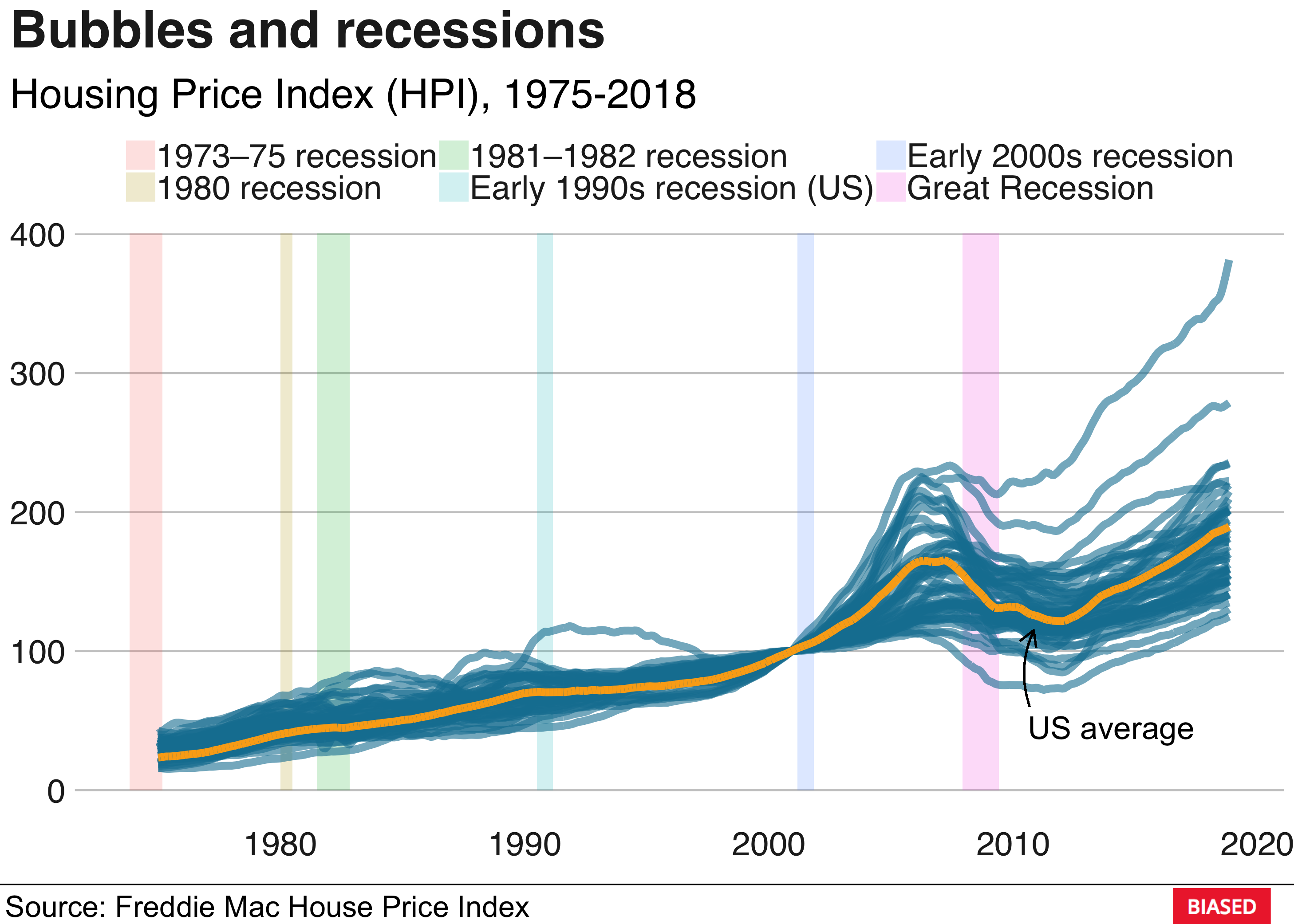
The blue lines are the HPIs for the different US states and the orange line is the national average. The housing bubble of 2007 is clearly visible. The collapse of the housing market was followed by a major credit crisis which ultimately led to the Great Recession. A more dramatic way of visualising this is to approximate the derivative of the HPI by calculating the monthly differences:
hpi_index %>%
  group_by(state, year) %>%
  mutate(index_change = price_index - lag(price_index), # Approx. the derivative
         us_avg_change = us_avg - lag(us_avg)) %>% # Approx. the derivative
  ungroup() %>%
  na.omit() %>%
  unite(date, year, month, sep = "-") %>%
  mutate(date = ymd(paste(date, "1", sep="-"))) %>%
  ggplot() +
  geom_rect(data = recessions_clean,
          aes(xmin = start, xmax = end,
              ymin = -Inf, ymax = Inf,
              group = name, fill = name), alpha = 0.2) +
  geom_line(aes(x = date, y = index_change, group = state), lwd = 1, alpha = 0.4, color = "#1380A1") +
  geom_hline(yintercept = 0, lwd = 0.5) +
  geom_line(aes(x = date, y = us_avg_change), color = "#FAAB18", lwd = 2) +
  labs(title = "Rate of change of HPI", subtitle = "Monthly finite differences, 1975-2018") +
bbplot::bbc_style() 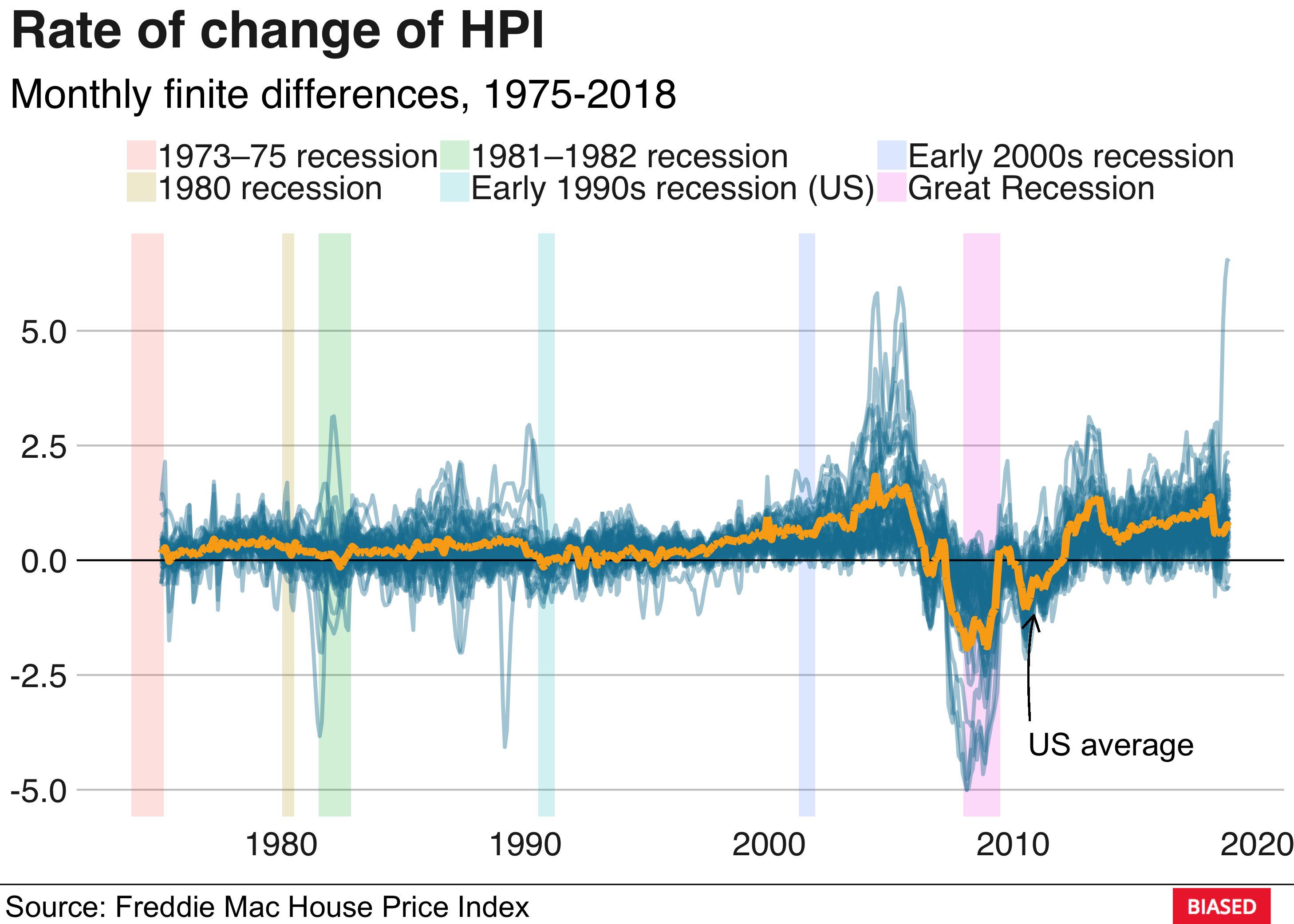
That’s it for this week. Thanks for reading, I hope you enjoyed it!