I must admit that I wasn’t too excited about this week’s #tidytuesday dataset from the United States Department of Agriculture (USDA) concerning cows and milk products. I thought I might give it a rest this week, but then I stumbled across a post on r/rstats linking to this Medium post by the folks at the BBC’s department for visual and data journalism.
In brief, the post describes how the team transitioned from exploring data using ggplot2, to using the tidyverse to produce publication-ready plots. In their own words:
We used R and in particular R’s data visualisation package ggplot2 for data exploration, to visualise patterns and help us understand the data and find stories. But we stopped short of building charts in the BBC News graphics style ready for publication on the site. […] To create graphics to accompany stories on the BBC News website, we had two main options: if there was enough time, we could commission graphics from our design team. If we needed a quick turnaround, opt for our in-house chart tool instead.
I used to work at a fairly large newspaper before I got into mathematics and statistics, and we had the same basic approach to graphics (except that the initial exploration was usually not done in R). So I was fascinated to learn about the recent approach to graphics production taken by the BBC:
In the first months of 2018 some curious members of the data team started experimenting, diving deep into the internals of the ggplot2 package in a bid to figure out how close we could get to replicating the BBC’s in house style. In March last year, we published our first chart made from start to finish using ggplot2. […] In short, it was a game changer, so we quickly turned our attention to how best manage this newly-discovered power.
Their work resulted in a package called bbplot, which leverages ggplot2 to make production-grade graphics in the BBC’s in-house aesthetic style. As a former journalist I think it’s really cool that one of the largest and most respected broadcasters in the world is using the capabilites of ggplot2 to streamline their journalism. The authors have also written a really nice plotting cookbook that deals with frequently asked questions.
Setup
Install bbplot by typing devtools::install_github('bbc/bbplot') into your console.
library(bbplot)
library(tidyverse)
library(forcats)
library(knitr)
library(kableExtra)

DIR <- "~/Documents/GitHub/tidytuesday/data/2019/2019-01-29/"

read_files <- function(file) {
  read_csv(paste0(DIR, file))
}

files <- list.files(DIR, pattern = "*.csv")
print(files)
## [1] "clean_cheese.csv" "fluid_milk_sales.csv"
## [3] "milk_products_facts.csv" "milkcow_facts.csv"
## [5] "state_milk_production.csv"In this post we’ll focus on milkcow_facts.csv, milk_products_facts.csv and fluid_milk_sales.csv.
Milk cow data
milkcow_facts.csv unsurprisingly contains facts about milk cows.
milkcow_facts <- read_files(files[4])
glimpse(milkcow_facts)
## Observations: 35
## Variables: 11
## $ year <dbl> 1980, 1981, 1982, 1983, 1984, 19...
## $ avg_milk_cow_number <dbl> 10799000, 10898000, 11011000, 11...
## $ milk_per_cow <int> 11891, 12183, 12306, 12622, 1254...
## $ milk_production_lbs <dbl> 1.28406e+11, 1.32770e+11, 1.3550...
## $ avg_price_milk <dbl> 0.130, 0.138, 0.136, 0.136, 0.13...
## $ dairy_ration <dbl> 0.04837357, 0.05035243, 0.044221...
## $ milk_feed_price_ratio <dbl> 2.717149, 2.759031, 3.088127, 2....
## $ milk_cow_cost_per_animal <int> 1190, 1200, 1110, 1030, 895, 860...
## $ milk_volume_to_buy_cow_in_lbs <dbl> 9153.846, 8695.652, 8161.765, 75...
## $ alfalfa_hay_price <dbl> 72.00000, 70.90000, 72.73333, 78...
## $ slaughter_cow_price <dbl> 0.4573000, 0.4193000, 0.3996000,...We can start by making a few simple line plots and adding bbc_style:
source <- "Source: United States Department of Agriculture (2017)"

milkcow_facts %>%
  ggplot(aes(x = year, y = milk_per_cow)) +
  geom_line(color = "#1380A1", lwd=2) +
  labs(title = "More milk...", subtitle = "Average amount of milk per cow (in lbs)", x = "Year", y = "Milk (lbs)") +
  bbc_style()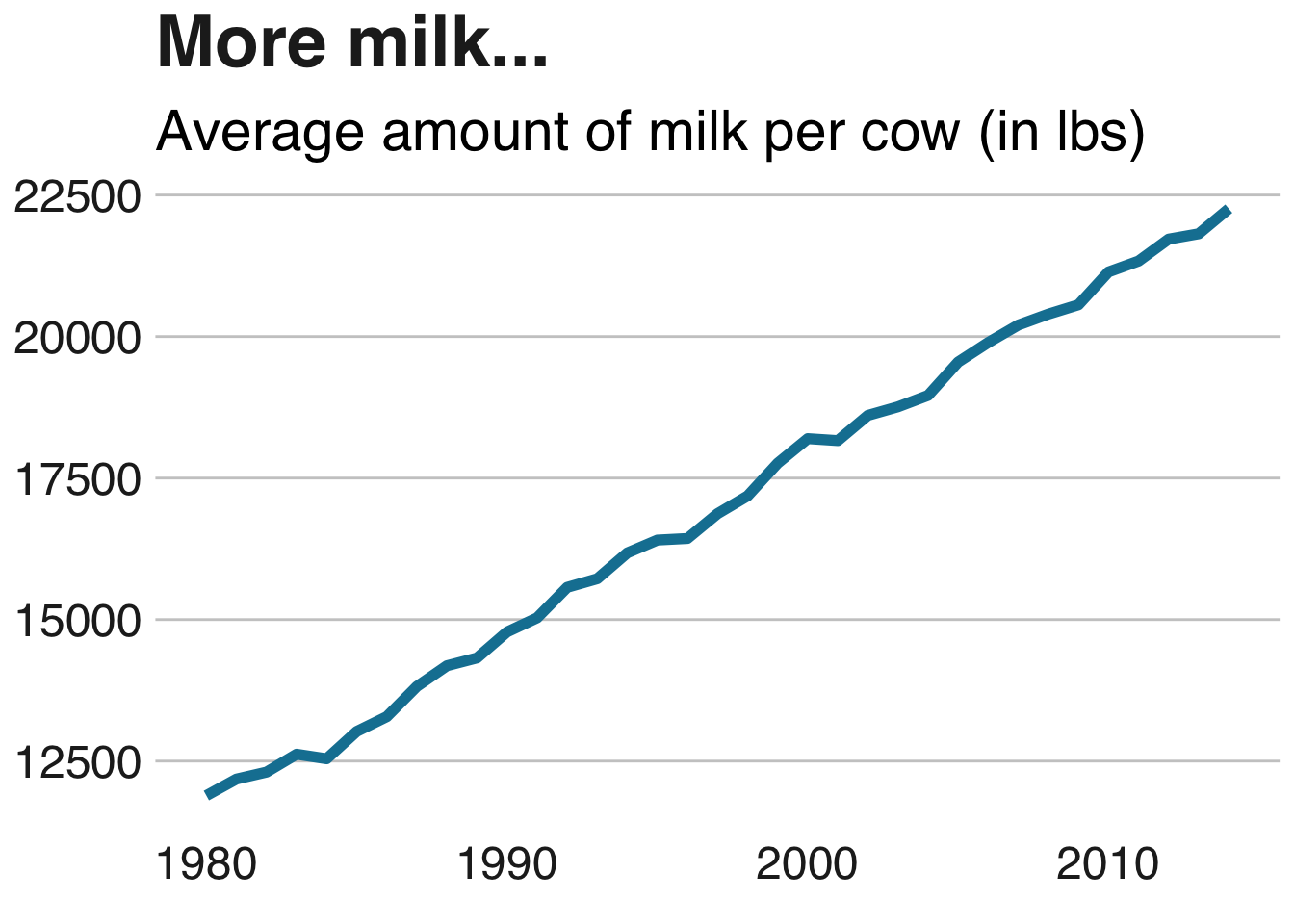
milkcow_facts %>%
  ggplot(aes(x = year, y = avg_price_milk)) +
  geom_line(color="#1380A1", lwd=2) +
  labs(title = "... and pricier milk...", subtitle = "Average cost of milk (USD per lbs)") +
  bbc_style()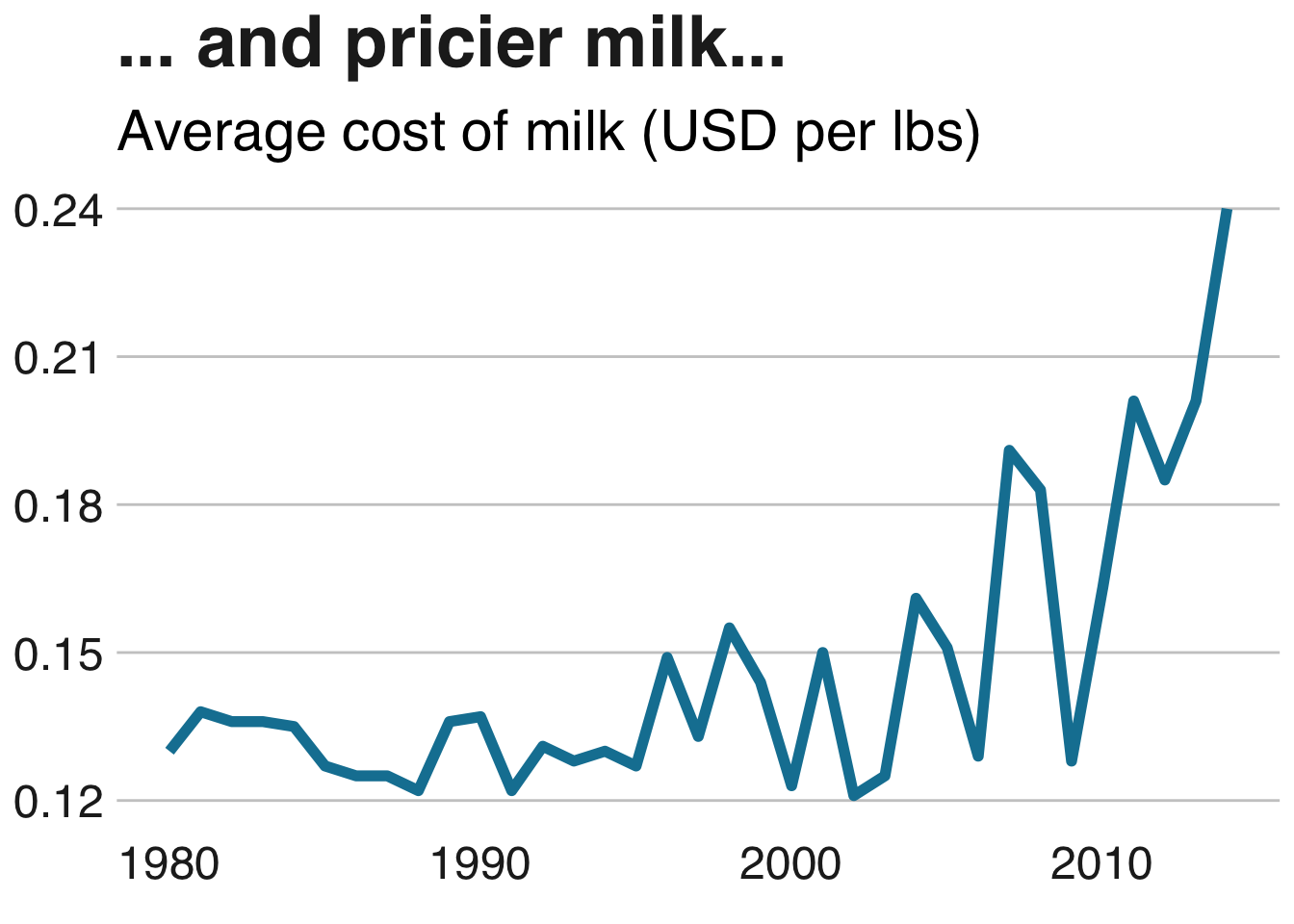
milkcow_facts %>%
  ggplot(aes(x = year, y = avg_milk_cow_number)) +
  geom_line(color = "#1380A1", lwd=2) +
  labs(title = "... along with less cows...", subtitle = "Average number of milk cows", x = "Year", y = "Milk (lbs)") +
  bbc_style()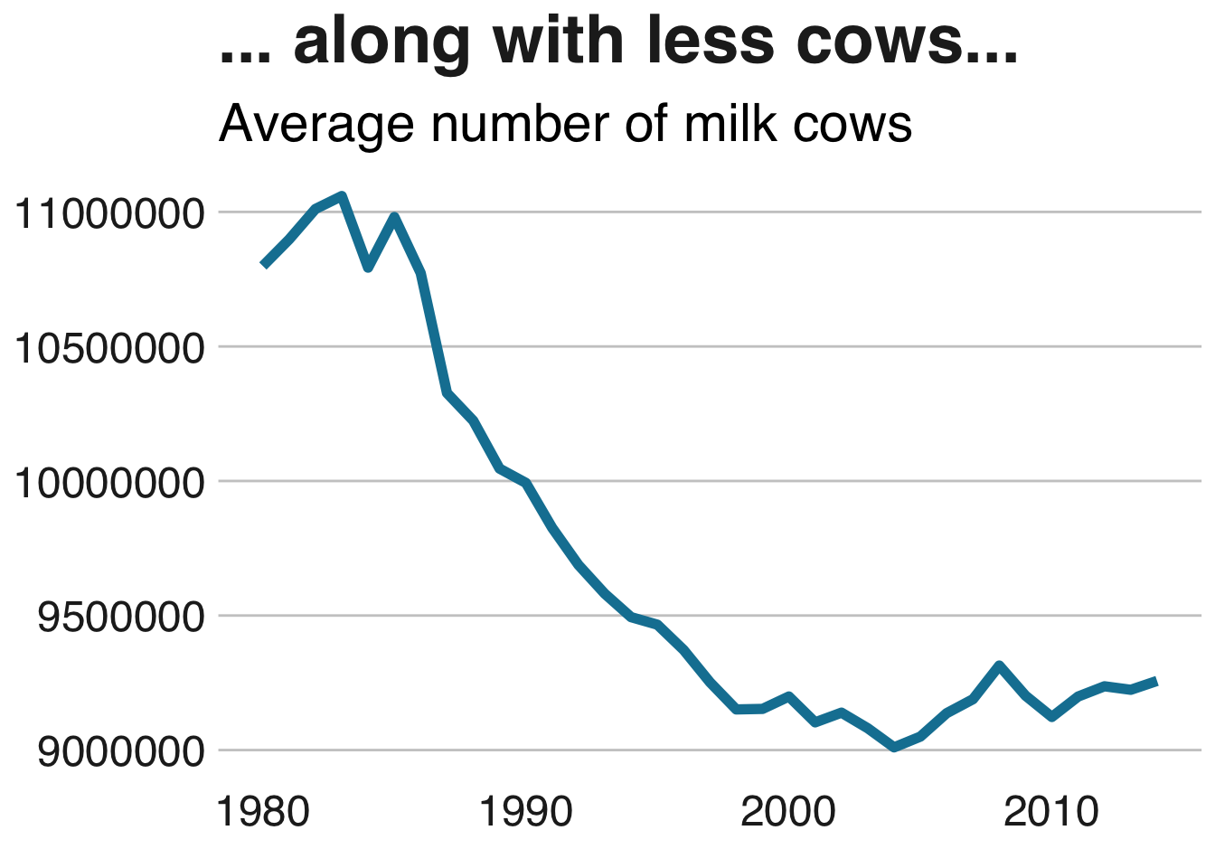
milkcow_facts %>%
  mutate(earnings = avg_price_milk*milk_per_cow) %>%
  gather(key, usd, c("earnings", "milk_cow_cost_per_animal")) %>%
  select(year, key, usd) %>%
  ggplot(aes(x = year, y = usd, color = key)) +
  geom_line(lwd=2) +
  scale_color_manual(values = c("earnings" = "#1380A1", "milk_cow_cost_per_animal" = "#FAAB18"),
                       labels = c("Avg. income", "Avg. expenses")) +
  labs(title = "... increases margins", subtitle = "Producing more milk with less cows\nmeans more cash") +
  bbc_style()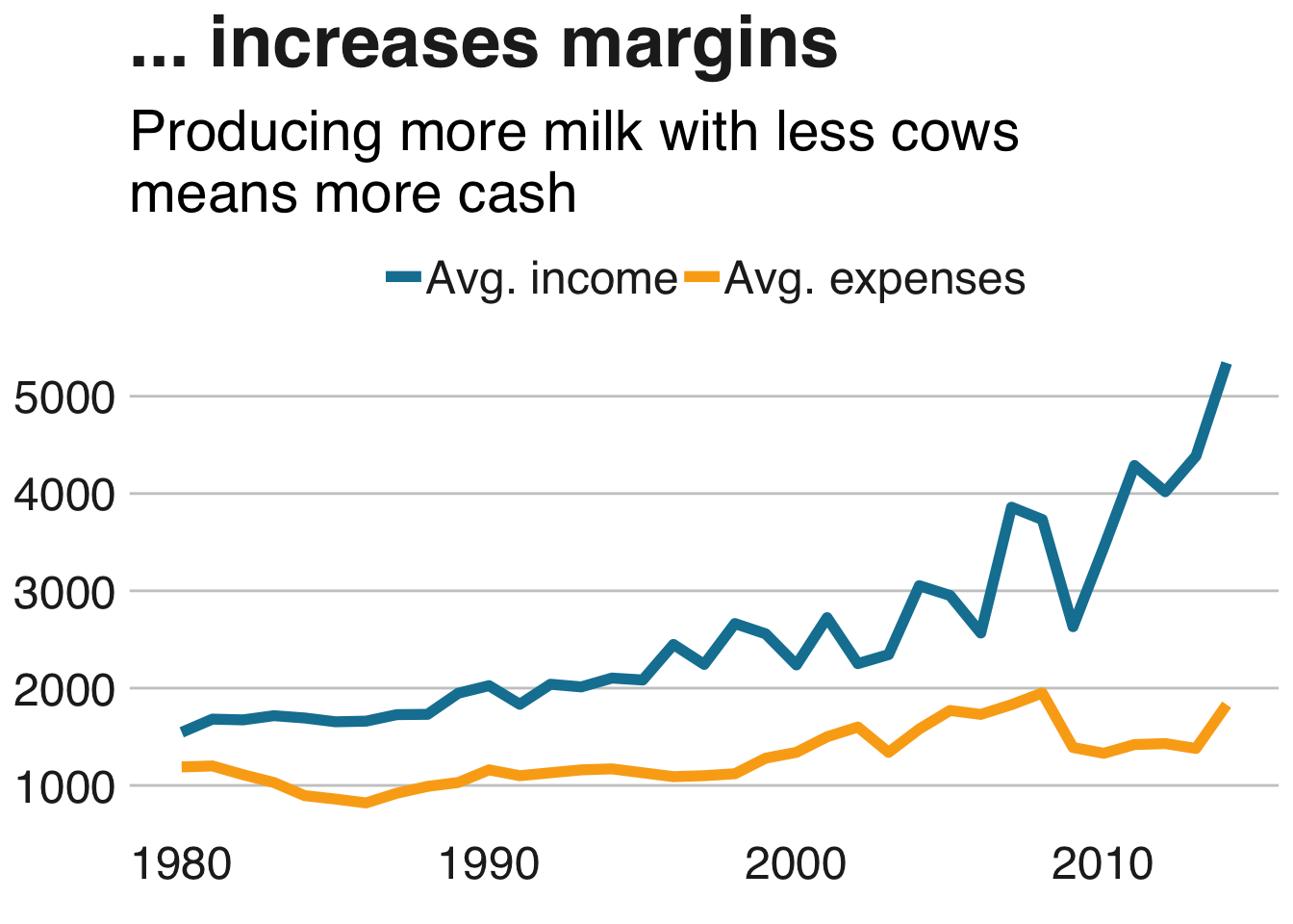
I’m really digging the aesthetics so far; clean, clear and simple. Let’s see what we can learn about the consumption of milk products next.
Milk product data
milk_products_data.csv gives an overview of the average yearly consumption (in lbs) of dairy products.
# Importing data
milk_products <- read_files(files[3])
glimpse(milk_products)
## Observations: 43
## Variables: 18
## $ year <int> 1975, 1976, 1977, 1978, 1979, ...
## $ fluid_milk <int> 247, 247, 244, 241, 238, 234, ...
## $ fluid_yogurt <dbl> 1.967839, 2.132685, 2.338369, ...
## $ butter <dbl> 4.728193, 4.313202, 4.294180, ...
## $ cheese_american <dbl> 8.147222, 8.883106, 9.213005, ...
## $ cheese_other <dbl> 6.126409, 6.627872, 6.781846, ...
## $ cheese_cottage <dbl> 4.588537, 4.632284, 4.617711, ...
## $ evap_cnd_canned_whole_milk <dbl> 3.949932, 3.791703, 3.265569, ...
## $ evap_cnd_bulk_whole_milk <dbl> 1.2385962, 1.1008644, 1.003802...
## $ evap_cnd_bulk_and_can_skim_milk <dbl> 3.525306, 3.590506, 3.879376, ...
## $ frozen_ice_cream_regular <dbl> 18.20505, 17.63845, 17.28895, ...
## $ frozen_ice_cream_reduced_fat <dbl> 6.502202, 6.169193, 6.574222, ...
## $ frozen_sherbet <dbl> 1.348780, 1.364460, 1.356254, ...
## $ frozen_other <dbl> 1.816894, 1.678171, 1.627777, ...
## $ dry_whole_milk <dbl> 0.1000000, 0.2000000, 0.200000...
## $ dry_nonfat_milk <dbl> 3.261769, 3.504864, 3.308311, ...
## $ dry_buttermilk <dbl> 0.2000000, 0.2000000, 0.300000...
## $ dry_whey <dbl> 2.200000, 2.400000, 2.400000, ...So there are quite a lot of different kinds of products here. I’d like to replicate the relative population growth plot in the BBC cookbook for a subset of these.
To simplify things a bit and to keep the plots uncluttered I’ll use a trick I picked up during my first week of #tidytuesday: Combining levels with fct_collapse. Also, I’ll gather the different product types in order to easily group them during plotting. To smooth the plots out a bit I’ll downsample the data somewhat and only include every seventh year:
# Wrangling data
years = seq(1975, 2017, 7)

milk_products_gathered <- milk_products %>%
  filter(year %in% years) %>%
  gather(product, lbs, fluid_milk:dry_whey) %>%
  mutate(product = fct_collapse(product,
    "cheese" = c("cheese_american", "cheese_other", "cheese_cottage"),
    "evap_milk" = c("evap_cnd_canned_whole_milk", "evap_cnd_bulk_whole_milk",
                    "evap_cnd_bulk_and_can_skim_milk"),
    "ice_cream" = c("frozen_ice_cream_regular", "frozen_ice_cream_reduced_fat"),
    "dry_milk" = c("dry_whole_milk", "dry_nonfat_milk", "dry_buttermilk")
  )) %>%
  group_by(year, product) %>%
  summarise(lbs = sum(lbs)) %>%
  ungroup()

products <- c("butter", "cheese", "fluid_milk", "fluid_yogurt", "ice_cream")
names <- str_replace(str_to_title(str_remove(products, pattern = "fluid_")), "_", " ")

milk_products_selection <- milk_products_gathered %>%
  filter(product %in% products) %>%
  mutate(product = factor(product, labels = names)) # Changing factor names so they'll look nicer in plot

# Plotting
milk_products_selection %>%
  ggplot(aes(x = year, y = lbs, group = product, fill = product)) +
  geom_area() +
  geom_hline(yintercept = 0) +
  facet_wrap(~product, scales = "free", nrow = 2) +
  labs(title = "Yogurt bonanza!",
       subtitle = "Relative change in consumption (lbs), 1975-2017") +
  bbc_style() +
  theme(legend.position = "none",
        axis.text.x = element_blank(),
        axis.text.y = element_blank())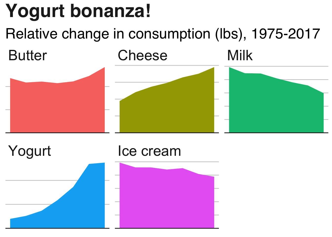
Evidently, the yogurt business is booming. Cheese consumption is also increasing, whereas the average consumption of milk and ice cream is decreasing. Butter consumption has increased somewhat after dipping down slightly.
Next I’d like to look at this from a different perspective, by using a grouped bar chart. Since milk dwarfs the other products in terms of average amount consumed, we will plot milk consumption separately. First, the non-milk products…
milk_products_selection %>%
  filter(year == 1975 | year == 2017,
         product != "Milk") %>%
  ggplot(aes(x = product, y = lbs, fill = as.factor(year))) +
  geom_bar(stat = "identity", position = "dodge") +
  geom_hline(yintercept = 0, size = 1) +
  scale_fill_manual(values = c("#1380A1", "#FAAB18")) +
  labs(title = "Consumer habits", subtitle = "Avg. consumption per person (lbs)") +
  bbc_style()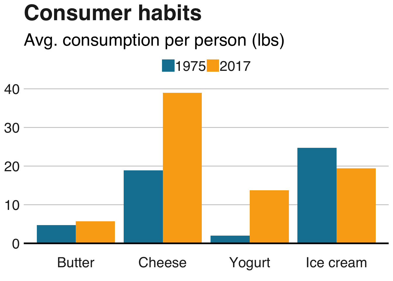
… and onto milk:
milk_products_selection %>%
  filter(year == 1975 | year == 2017,
         product == "Milk") %>%
  ggplot(aes(x = product, y = lbs, fill = as.factor(year))) +
  geom_bar(stat = "identity", position = "dodge") +
  geom_hline(yintercept = 0, size = 1) +
  scale_fill_manual(values = c("#1380A1", "#FAAB18")) +
  labs(title = "We're drinking less milk", subtitle = "Avg. consumption per person (lbs)") +
  bbc_style()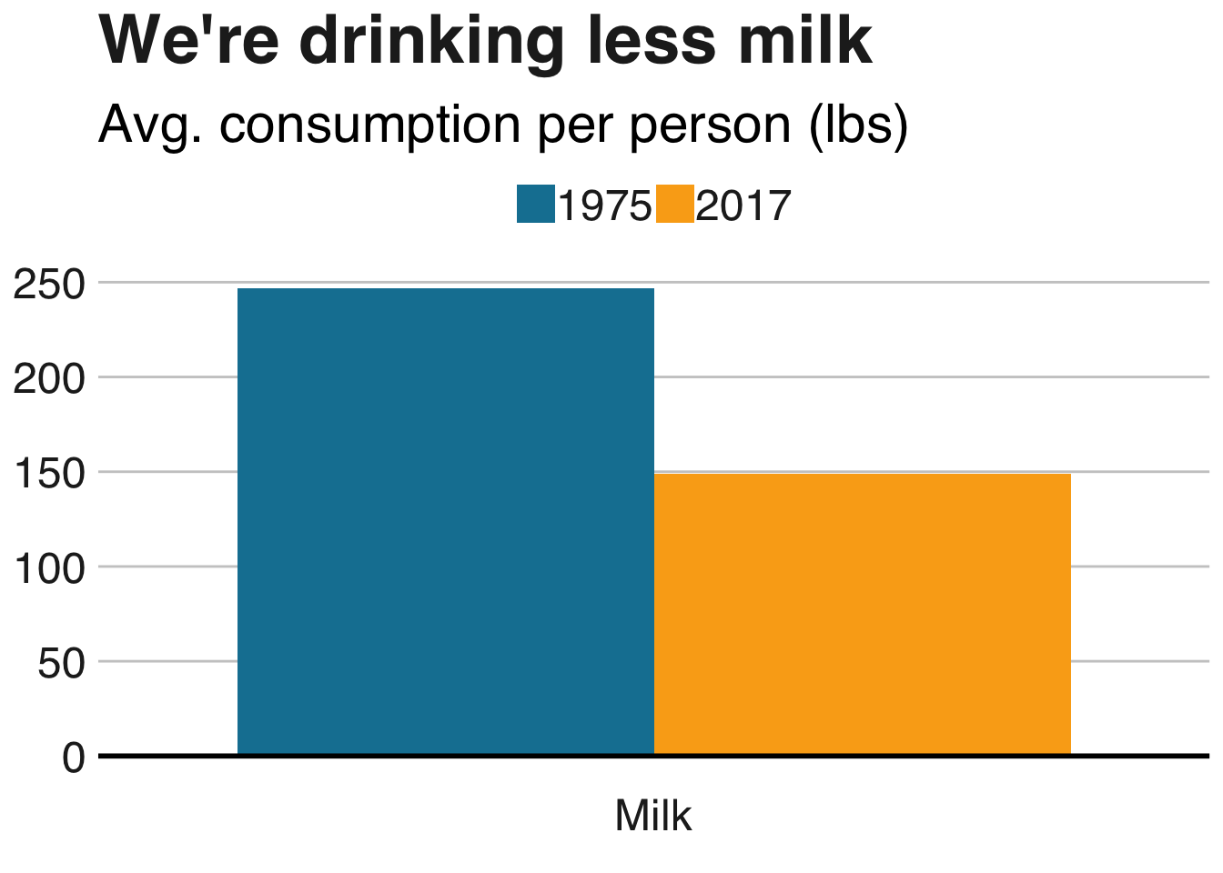
Cool! Finally, let’s move on to our final dataset for this week.
Fluid milk sales data
fluid_milk_sales.csv contains the total amount (in lbs) of different kinds of milk types sold per year. To get an idea of what this looks like, let’s take a look at the data from 1975:
#Importing data
fluid_milk_sales <- read_files(files[2])

fluid_milk_sales %>%
  filter(year == 1975) %>%
  kable() %>%
kable_styling(bootstrap_options = c("striped", "condensed"))| year | milk_type | pounds |
|---|---|---|
| 1975 | Whole | 3.6188e+10 |
| 1975 | Reduced Fat (2%) | 8.7260e+09 |
| 1975 | Low Fat (1%) | 2.7420e+09 |
| 1975 | Skim | 2.4800e+09 |
| 1975 | Flavored (Whole) | 1.3660e+09 |
| 1975 | Flavored (Not Whole) | 7.1900e+08 |
| 1975 | Buttermilk | 1.0110e+09 |
| 1975 | Eggnog | 7.6000e+07 |
| 1975 | Total Production | 5.3308e+10 |
First, I’ll do some spreading and gathering to separate the Total Production factor into it’s own column. Next, I’ll calculate the fraction of each milk type sold and make a bar plot. bbplot contains a function called finalise_plot. Calling it will output your plot to an image file, and if you specify the source_name and logo_image_path arguments you will get a nifty looking plot with a footer containing the source of the data and your logo of choice.
# Wrangling
fluid_milk_sales_pct <- fluid_milk_sales %>%
  spread(milk_type, pounds) %>%
  gather(milk_type, pounds, -c("year", "Total Production")) %>%
  group_by(year) %>%
  mutate(pct_sold = pounds/`Total Production`)

# Plotting
p1 <- fluid_milk_sales_pct %>%
  ggplot(aes(x = year, y = pct_sold, fill = milk_type)) +
  geom_bar(stat="identity") +
  scale_y_continuous(labels = scales::percent) +
  labs(title = "Reducing fat and adding flavor", subtitle = "Percentage of milk type sold per year, 1975-2017") +
  bbc_style()

finalise_plot(p1, save_filepath = "milk_sales.png", source_name = source, logo_image_path = "logo.png")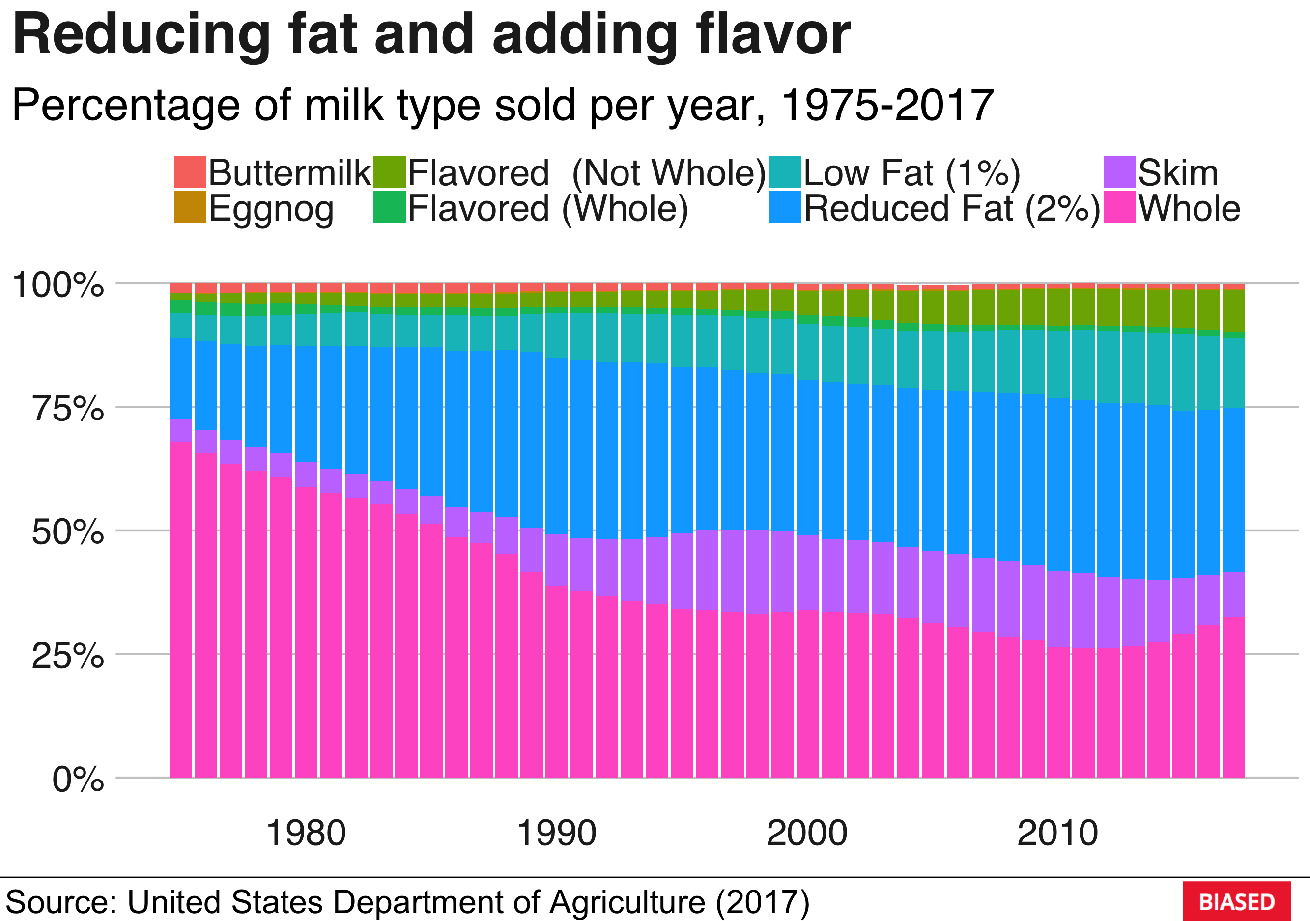
There we go! A publishable plot in the style of the BBC, with your own personal logo. Nice!
That’s it for this week, I hope you enjoyed it!