This week was my Tidy Tuesday debut! Tidy Tuesday is a weekly data project which is aimed at R users who want to practice their wrangling and visualisation skills within the tidyverse. This week’s data set features a historical record of rocket launches, and formed the basis for the article “The space race is dominated by new contenders”.
My goals for this week were to:
- Expose myself to
gganimate, a really nifty package that extendsggplot2to include animations. - Practice tidy evaluation by building a few reusable functions for plotting.
I won’t focus on the details of the data wrangling in this post. I recommend you watch David Robinson’s excellent Tidy Tuesday screencast, where I picked up some cool tricks. One that I would like to highlight, and that I will definitely add to my toolbox, is the use of fct_collapse and fct_lump from the forcats package. It allows us to easily collapse several factors into manually defined groups. To see how this works, first consider the unprocessed data:
library(tidyverse)
library(gganimate)
library(countrycode)
library(knitr)
library(kableExtra)

dir <- "/Users/sean/Documents/spacerace/"
launches_csv <- "launches.csv"
launch_data <- read_csv(paste(dir, launches_csv, sep=""))

launch_data %>%
  count(state_code, sort = TRUE) %>%
  kable() %>%
kable_styling(bootstrap_options = c("striped", "condensed"))| state_code | n |
|---|---|
| SU | 2444 |
| US | 1716 |
| RU | 734 |
| CN | 302 |
| F | 291 |
| J | 115 |
| IN | 65 |
| I-ESA | 13 |
| IL | 10 |
| I | 9 |
| IR | 8 |
| KP | 5 |
| CYM | 4 |
| I-ELDO | 3 |
| KR | 3 |
| BR | 2 |
| UK | 2 |
The table above shows the number of launches by nation. Some of these are actually not nations (such as I-ESA, which represents the European Space Agency). We will deal with these shortly. Given the table above, we would like to:
- Collapse SU (Soviet Union) and RU (Russia) into one factor.
- Correct the state abbreviations so that we can conveniently fetch state names using the
countrycodepackage. - Keep the top six nations, and lump the rest into a group called
Other. - Deal with missing values resulting from abbreviations which do not correspond to a country in step 2.
The following chunk shows how to do all of the above:
processed <- launch_data %>%
  mutate(state_code_cleaned = fct_collapse(
    state_code,
    "RU" = c("RU", "SU"), # Collapsing SU and RU into a single factor RU
    "FR" ="F",
    "JP" = "J",
    "IT" = "I")) %>%
  mutate(state_name = countrycode( # Using countrycode to obtain state names
    state_code_cleaned,
    "iso2c",
    "country.name")) %>%
  mutate(state_name = fct_lump(state_name, 6)) %>% # Lumping factors not in top six into "Other"
  replace_na(list(state_name = "Other")) # Dealing with names (e.g. I-ESA) that countrycode can't handle. Since these are not in the top six we simply assign them to "Other".

processed %>%
  count(state_name, sort = TRUE) %>%
  kable() %>%
kable_styling(bootstrap_options = c("striped", "condensed"))| state_name | n |
|---|---|
| Russia | 3178 |
| United States | 1716 |
| China | 302 |
| France | 291 |
| Japan | 115 |
| India | 65 |
| Other | 59 |
Pretty cool! Anyway, on to the visualisations. Following Robinson’s screencast, I ended up with the following plot:
processed %>%
  count(state_name, launch_year) %>%
  ggplot(aes(x = launch_year, y = n, group = state_name)) +
  geom_line(aes(color = state_name)) +
  labs(title = "Number of yearly launches", x = "Year", y = "Launches") +
  theme_minimal() +
  theme(legend.title = element_blank())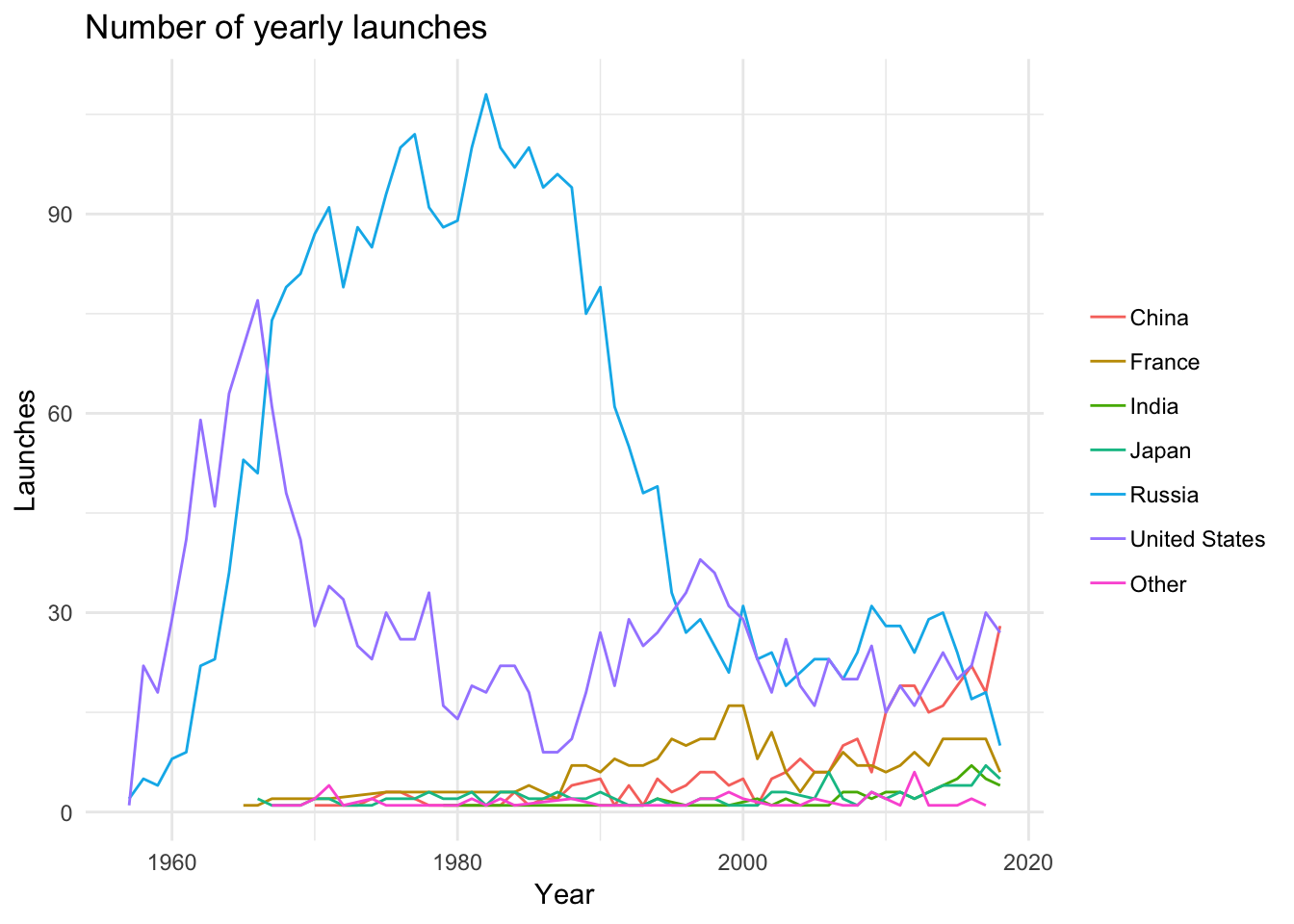
The next step was to use gganimate to liven things up a bit. Following the time series example from the gganimate documentation, I ended up with the following:
processed %>%
  count(agency_type, launch_year) %>%
  ggplot(aes(x = launch_year, y = n, group = agency_type)) +
  geom_line(aes(color = agency_type), show.legend = FALSE) +
  geom_segment(aes(xend = 2020, yend = n), linetype = 2, colour = 'grey') +
  geom_point(aes(color = agency_type), show.legend = FALSE, size = 2) +
  geom_text(aes(x = 2021, color = agency_type, label = agency_type), show.legend = FALSE, hjust = 0) +
  transition_reveal(launch_year) +
  coord_cartesian(clip = 'off') +
  labs(title = "Number of yearly launches", x = "Year", y = "Launches") +
  theme_minimal() +
  theme(plot.margin = margin(5.5, 40, 5.5, 5.5))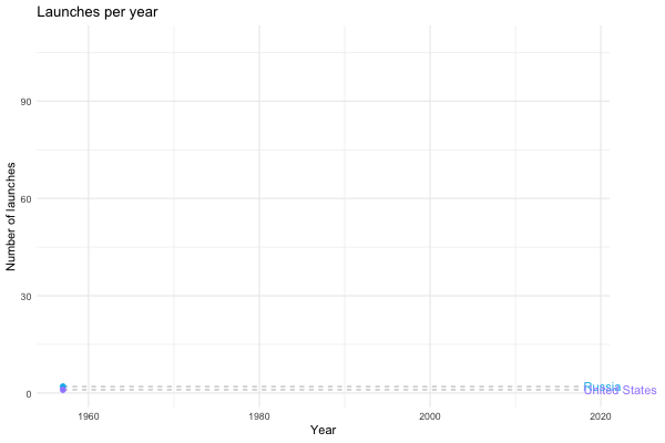
Now we’re talking! Next, I wanted to define a relatively general function that allowed me to use the same framework to visualise the growing influence of the private sector in space travel. I would also like the option to set a lower bound for time period I’m interested in, and I would like to be able to specify which countries I’m interested in plotting. Using tidy evaluation, I ended up with the following:
launches_per_year <- function(df, variable, countries = c(), from.year = NA, size.margin = 50){

  var <- enquo(variable)

  if(length(countries) != 0) df <- df %>% filter(state_name %in% countries)
  if(!is.na(from.year)) df <- df %>% filter(launch_year >= from.year)

  p <- df %>%
    count(!! var, launch_year) %>%
    ggplot(aes(x = launch_year, y = n, group = !! var)) +
      geom_line(aes(color = !! var)) +
      geom_segment(aes(xend = max(launch_year), yend = n), linetype = 2, colour = 'grey') +
      geom_point(aes(color = !! var), size = 2) +
      geom_text(aes(x = max(launch_year), color = !! var, label = !!  var), hjust = 0) +
      transition_reveal(launch_year) +
      coord_cartesian(clip = 'off') +
      labs(title = "Number of yearly launches", x = "Year", y = "Launches") +
      theme_minimal() +
      theme(plot.margin = margin(t = 5.5, b = 5.5, r = size.margin, l = 5.5),
            legend.position = "none")

  return(p)
}
Now I can call launches_per_year with different arguments to generate different plots. For instance, we can see how the private sector gets increasingly involved in space flight…
launches_per_year(processed, agency_type)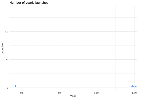
… or we could look at the same plot for the last 20 years instead.
launches_per_year(processed, agency_type, from.year = 2000)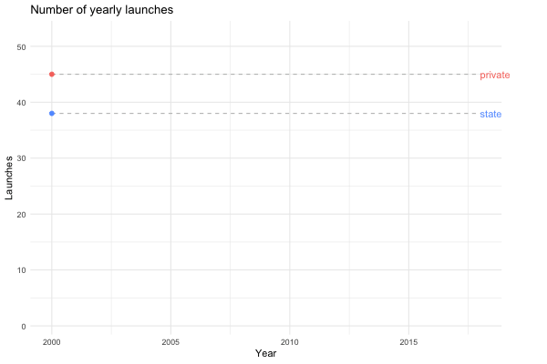
Maybe we’re interested in visualising how China has become a spacefaring nation to be reckoned with…
launches_per_year(processed, state_name, countries = c("United States", "Russia", "China"), from.year = 1990)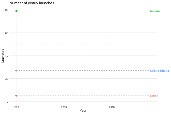
I was also interested in the yearly success rates of nations and agency types (public/private/startups). Again, building a relatively general function allows me to explore different options:
learning_to_fly <- function(df, variable, names = c()){

  var <- enquo(variable)

  if(length(names) != 0) df <- df %>% filter(!! var %in% names)
  print(dim(df))

  p <- df %>%
    ggplot(aes(x = launch_year, y = success_rate, group = !! var)) +
    geom_line(aes(color = !! var), show.legend = FALSE) +
    geom_point(aes(color = !! var, size = number_launches)) +
    transition_reveal(launch_year) +
    labs(title = "Yearly success rate of rocket launches",
         x = "Year",
         y = "Successful launches (%)",
         size = "",
         color = "") +
    theme_minimal() +
    theme(plot.margin = margin(t = 5.5, b = 5.5, r = 50, l = 5.5),
          legend.position = "bottom",
          legend.text = element_text(size = rel(1.1)))

  return(p)
}
For example, if I want to plot the learning curves (if you will) of the American and Soviet/Russian space programs, I can do the following:
success_rates <- processed %>%
  group_by(state_name, launch_year) %>%
  summarise(success_rate = 100 * sum(category == "O") / (sum(category == "O") + sum(category == "F")),
            number_launches = n())

learning_to_fly(success_rates, state_name, names = c("Russia", "United States"))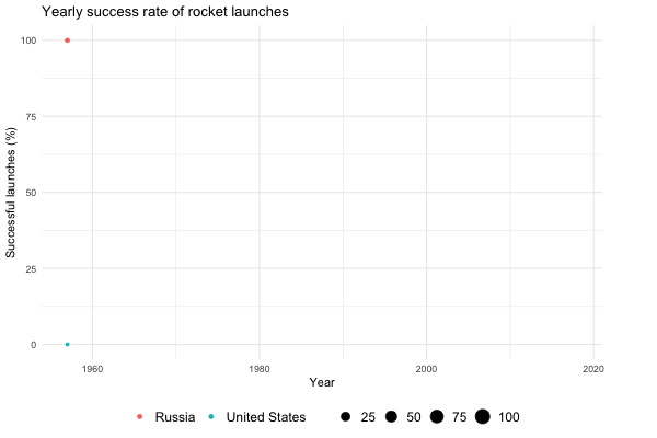
Note how the size of the points shrinks and expands. The size is relative to the number of launches for a given year, adding an extra dimension to the visualisation. Also note the abrupt dip in the number of successful American launches in 1986. This is a consequence of the Challenger disaster on January 28, which dealt a significant blow to the US manned space program.
That concludes this week’s Tidy Tuesday. Thanks for reading!