Last week’s #tidytuesday data about women in the workforce is provided by the Bureau of Labor Statistics and the Census Bureau.
As usual, we start by skimming the data to get a quick overview:
# Setup
library(tidyverse)
library(skimr)

# Loading data
csv <- "~/Documents/Github/tidytuesday/data/2019/2019-03-05/jobs_gender.csv"
jobs_gender <- read_csv(csv)
jobs_gender %>%
skim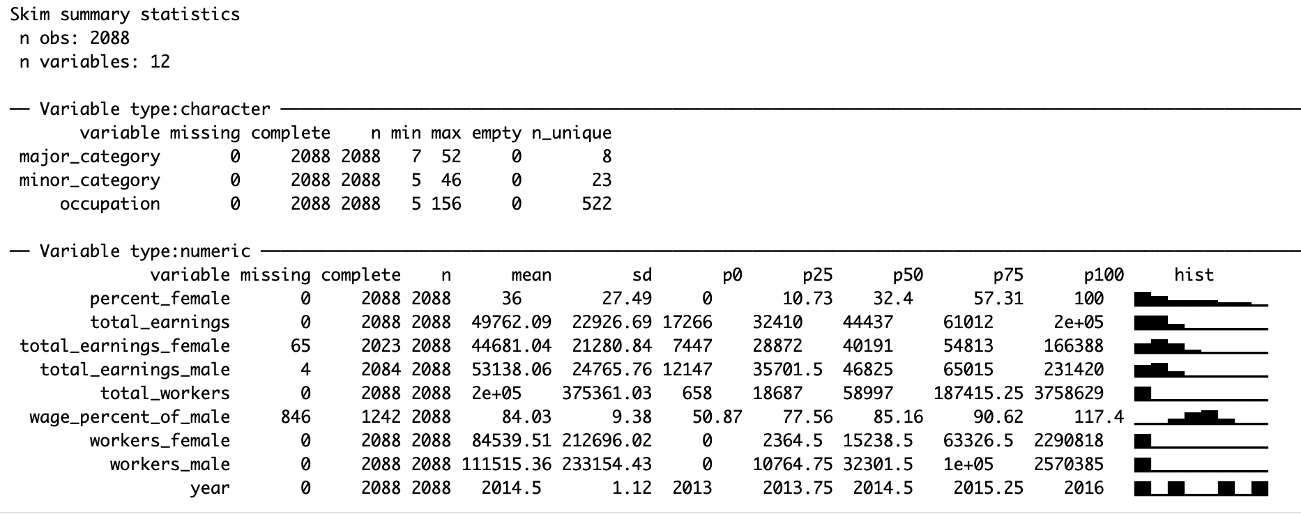
There are some missing values in total_earnings_female (estimated median wages for females). There are also quite a few NA’s in wage_percent_of_male (female wages as percent of male wages), which according to the #tidytuesday repo indicates small sample sizes for those occupations.
To narrow things down, let’s look at the data from 2016 and check out where the missing values are:
# Overview of missing data
jobs_gender %>%
  filter(year == 2016) %>%
  group_by(major_category) %>%
  summarise_all(~ sum(is.na(.))) %>%
  select_if(~ is.character(.) | (is.numeric(.) && sum(.) != 0)) %>%
knitr::kable()| major_category | total_earnings_male | total_earnings_female | wage_percent_of_male |
|---|---|---|---|
| Computer, Engineering, and Science | 0 | 1 | 21 |
| Education, Legal, Community Service, Arts, and Media | 0 | 0 | 8 |
| Healthcare Practitioners and Technical | 1 | 0 | 8 |
| Management, Business, and Financial | 0 | 0 | 4 |
| Natural Resources, Construction, and Maintenance | 0 | 11 | 63 |
| Production, Transportation, and Material Moving | 0 | 5 | 75 |
| Sales and Office | 0 | 0 | 14 |
| Service | 0 | 1 | 17 |
It’s not immediately clear to me what is meant by “small sample sizes” in the context of relative wage differences. There seems to be enough underlying data to estimate the median wages for both sexes in most cases, but not for measuring relative differences. For now, let’s just remove all missing values to avoid any confusion.
# Tidying data
jobs_2016_tidy <- jobs_gender %>%
  filter(year == 2016) %>%
  na.omit() %>%
  group_by(major_category) %>%
  summarise(total_workers = sum(total_workers),
            male_numworkers = sum(workers_male),
            female_numworkers = sum(workers_female),
            female_pay = mean(total_earnings_female),
            male_pay = mean(total_earnings_male),
            female_pctworkforce = mean(percent_female) / 100) %>%
  mutate(male_pctworkforce = 1 - female_pctworkforce,
         major_category = fct_reorder(major_category, male_pctworkforce)) %>%
  gather("gender", "value", -major_category, -total_workers) %>%
  separate(gender, c("gender", "statistic"), sep = "_") %>%
  mutate(statistic = fct_recode(statistic,
                                "num_workers" = "numworkers",
                                "pct_workers" = "pctworkforce"
                                )) %>%
  ungroup() %>%
  spread(statistic, value)
I’d like to visualise the proportions of males/females for each major_category, and I’d also like to plot the differences in wages across industries (using the wonderful bbplot package, as usual).
We start by plotting the proportion of sexes across the major categories of occupation:
# Gender representation
jobs_2016_tidy %>%
  ggplot(aes(major_category, pct_workers, fill = gender)) +
  geom_bar(stat = "identity") +
  geom_hline(yintercept = 0) +
  scale_y_continuous(labels = scales::percent) +
  coord_flip() +
  labs(title = "Gender representation across industries") +
  bbplot::bbc_style()
Next, let’s compare the average estimated wages for both genders:
# Average estimated pay
jobs_2016_tidy %>%
  group_by(major_category) %>%
  mutate(pct_of_male = ifelse(gender == "female", pay[gender == "female"] / pay[gender == "male"], 1)) %>%
  ggplot(aes(major_category, pay, fill = gender, label = round(pct_of_male, 2))) +
  geom_bar(stat = "identity", position = "dodge") +
  geom_hline(yintercept = 0) +
  geom_label(aes(label = ifelse(gender == "female", scales::percent(pct_of_male), NA)),
             hjust = 1, vjust = 1,
             colour = "white", fill = NA, label.size = NA,
             family="Helvetica", size = 6) +
  scale_y_continuous(labels = scales::dollar) +
  coord_flip() +
  labs(title = "Average estimated wages for males and females", subtitle = "Percentages indicate estimated female wages relative to estimated male wages in the same industry.") +
  bbplot::bbc_style()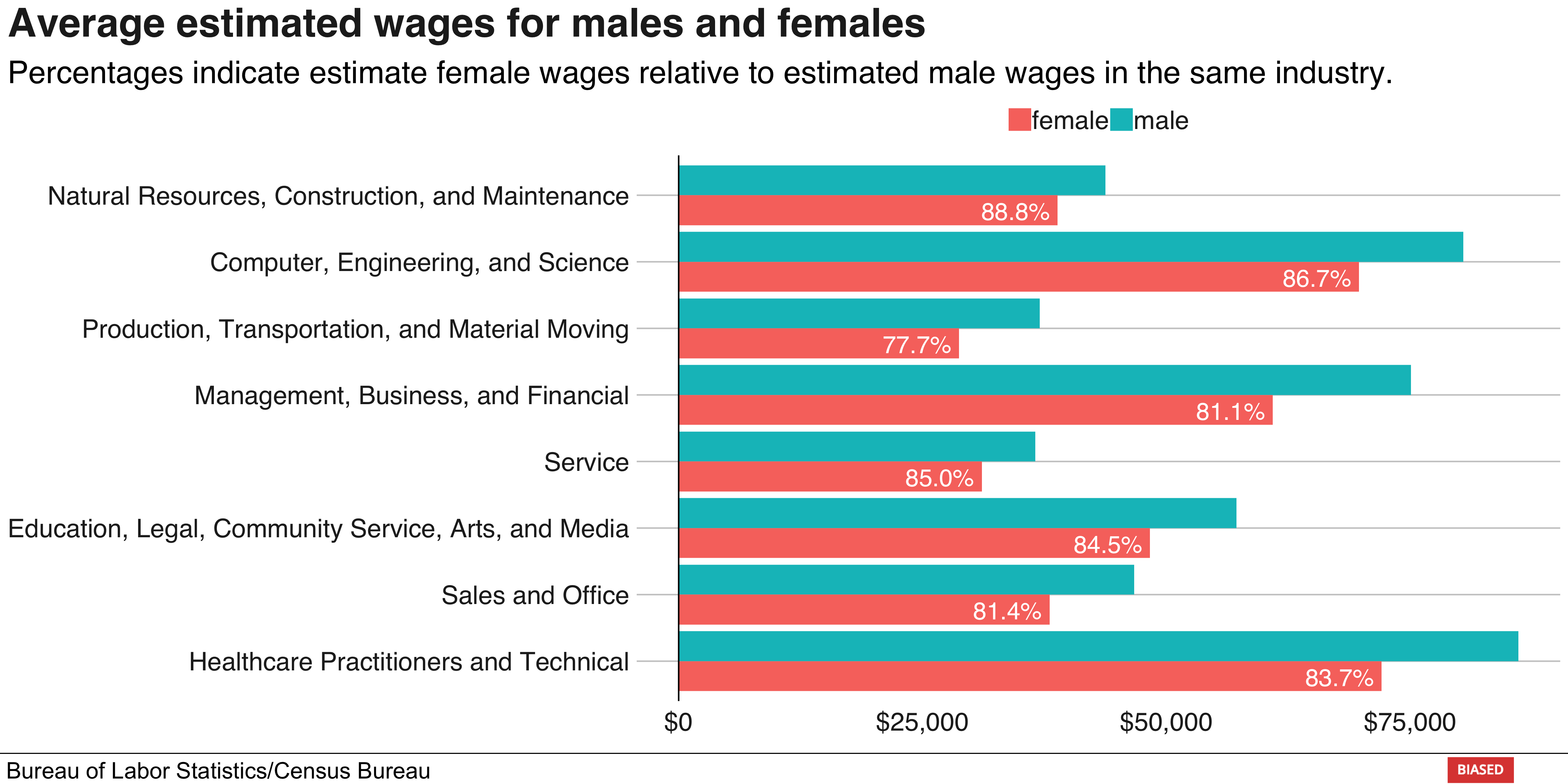
That’s it for now, thanks for reading!