If you’re familiar with the tidyverse, you’re most likely familiar with the pipe operator %>% from magrittr. The pipe operators
pipe their left-hand side values forward into expressions that appear on the right-hand side, i.e. one can replace
f(x)withx %>% f(), where%>%is the (main) pipe-operator (https://magrittr.tidyverse.org/).
%>% is an example of a special binary operator. Now, what’s cool about special binary operators is that we can define our own! I learned about this on Twitter the other day, but unfortunately I forgot to like the tweet and consequently can’t give credit where credit’s due. I will, however, shamelessly steal the idea for this week’s #tidytuesday data set which chronicles awarded PhDs in the US from 2008-2017.
# Importing packages
library(tidyverse)

# Loading data
DIR <- "~/Documents/GitHub/tidytuesday/data/2019/2019-02-19"
csvs <- list.files(DIR, pattern = "*.csv")
data <- read_csv(file.path(DIR, csvs))
Creating custom operators
The goal for this week is to write a function that takes a tibble and a function as arguments, and have it return a plot where the name of the function is used in the subtitle and legend.
We start by defining our special binary operator:
# Custom special binary operator
`%p%` <- function(lhs, rhs) return(paste0(lhs, rhs))
%p% will concatenate the left-hand string with the right-hand string. Like the pipe operator, %p% essentially lets us “pipe” the previously concatenated string into the next, creating a cascade of concatenations which results in a single string.
# Example
string <- "Using %p% we can " %p%
  "concatenate strings " %p%
  "a la piping in dplyr!"

print(string)
## [1] "Using %p% we can concatenate strings a la piping in dplyr!"Pretty neat! The next step is to somehow get a string representation of the name of a function. After some searching, this post on Stack Overflow offered one possible solution that uses the functions deparse and substitute:
whacky_function_name <- function(x){
  return("#tidytuesday is fun!")
}

function2string <- deparse(substitute(whacky_function_name))
print(function2string)
## [1] "whacky_function_name"Plotting PhDs
Now we just need to put the pieces together. I’m aiming for a diverging bars plot in the style of bbplot. Specifically, I’d like to make one that shows the number of PhDs awarded with respect to the average, and one with respect to the median. Here’s one possible approach:
# Plotting function
plot_phds <- function(df, f) {

  # Getting string representation of function
  f2string <- deparse(substitute(f))
  subtitle <- "Number of PhDs awarded relative to " %p% f2string %p% " (2008-2017)"

  # Counting number of PhDs, reordering
  data <- df %>%
    count(major_field, wt = n_phds) %>%
    arrange(desc(n)) %>%
    mutate(diff = n - f(n), # Computing difference from mean
           major_field = fct_reorder(major_field, diff))

  # Getting annotation
  annot <- "US " %p% f2string %p% " = " %p% as.character(f(data$n))

  # Creating diverging bars plot
  data %>%
    ggplot(aes(major_field, diff, fill = ifelse(sign(diff) > 0, "olivegreen", "firebrickred"))) +
    geom_bar(stat = "identity") +
    geom_hline(yintercept = 0, linetype = "dashed") +
    labs(title = "What's up Doc?", subtitle = subtitle) +
    scale_fill_discrete(label = c("Below " %p% f2string, "Above " %p% f2string)) +
    geom_curve(aes(x = "Teaching fields", y = 10000,
                 xend = "Economics", yend = 1000),
             size=0.5, curvature = 0.5,
             arrow = arrow(length = unit(0.03, "npc"))) +
    annotate(geom = "label", x = "Teaching fields", y = 16000, label = annot, size = 5) +
    coord_flip() +
    bbplot::bbc_style() +
    theme(axis.text.y = element_text(size = 12),
          panel.grid.major.x = element_line(color="#cbcbcb"),
          legend.justification = "left")
}
Now we just need to call the function with the appropriate arguments, and we’re done!
source_str <- "Source: National Science Foundation"
p1 <- plot_phds(data, mean)
bbplot::finalise_plot(p1, source = source_str,
                      save_filepath = "p1.png",
                      height = 600, width = 800,
                      logo_image_path = "logo.png")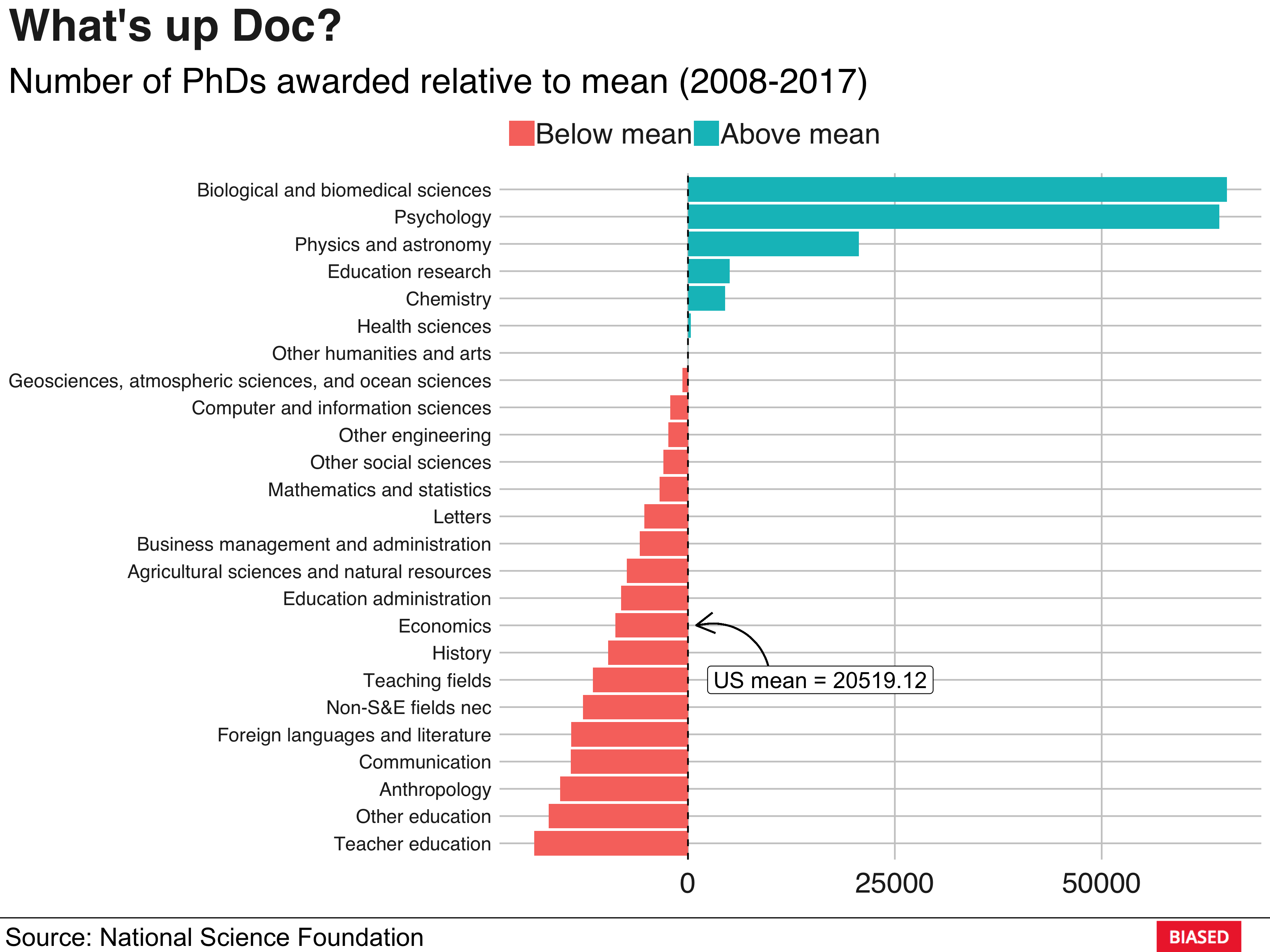
p2 <- plot_phds(data, median)
bbplot::finalise_plot(p2, source = source_str,
                      save_filepath = "p2.png",
                      height = 600, width = 800,
                      logo_image_path = "logo.png")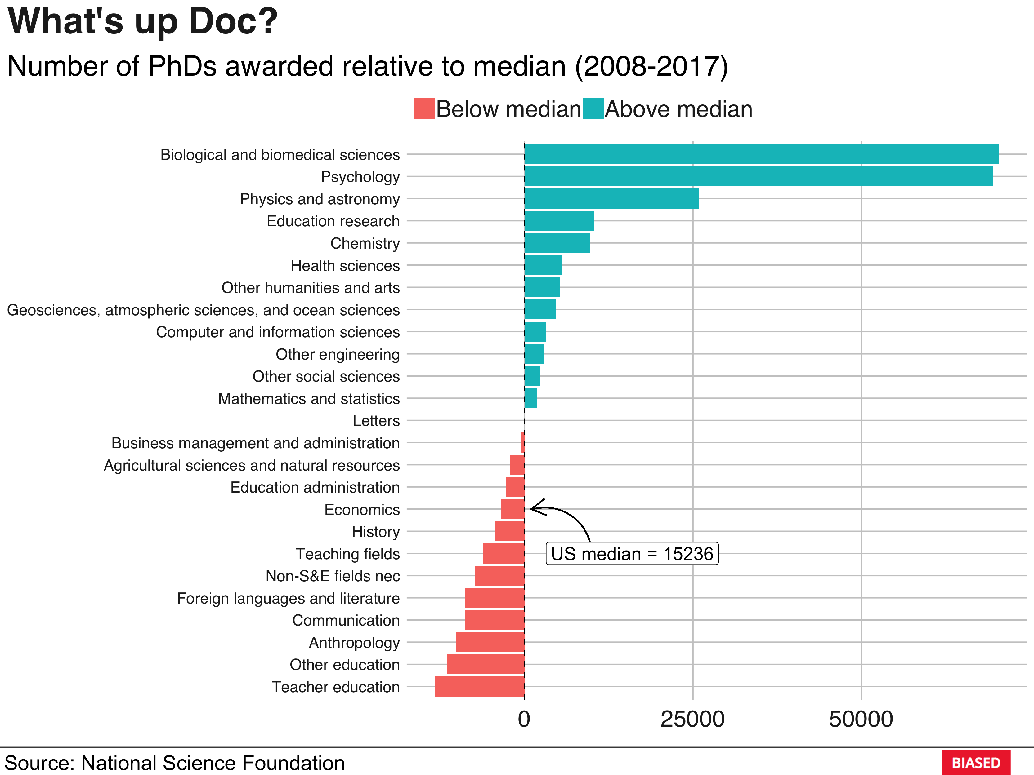
That’s it for this week, hope you enjoyed it. As usual, feedback is always welcome!