This week I want to try to use purrr to model many data sets efficiently. There are many great resources available; in this post we primarily rely on the following sources:
- Managing Many Models with tidyr, purrr and broom.
- Purrr - tips and tricks.
- Many models (chapter 25 in R for Data Science).
Most of my modelling experience comes from using scikit-learn in Python. In R, the parsnip package from tidymodels seems like an extremely promising approach that I will try to explore in future posts. For now we will use the excellent caret (classification and regression training) package by Max Kuhn.
# Setup
library(tidyverse)
library(broom)
library(skimr)
library(caret)
library(rsample)
Importing and skimming the data
We import the data like we did last week, using map. Recall that map iterates over the list or vector .x and applies .f to every element. In the following chunk we use formula notation to define .f as ~ read_csv(file.path(PATH, .x)). We also rename the elements of the resulting list to correspond to the names of the CSV-files, using the set_names function from purrr.
# Importing data
PATH <- "~/Documents/GitHub/tidytuesday/data/2019/2019-02-12"
csvs <- list.files(PATH, pattern="*.csv")

# Creating vector with file names
file_names <- str_remove(csvs, ".csv")

# Reading files
files <- map(csvs, ~ read_csv(file.path(PATH, .x)))

# Naming elements in list after file name
data <- set_names(files, file_names)
Like last week, we skim the data to get a quick first impression of the different data sets:
# Skimming data
data %>%
  map(skim)
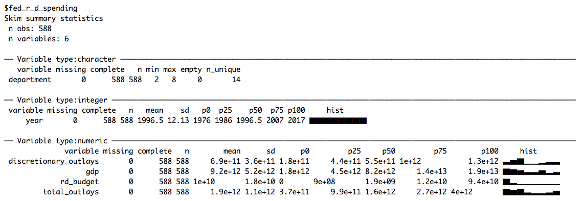
This week we’ll be working with fed_r_d_spending, which (among other things) contains the yearly research and development budgets for different departments and branches of the US government. Let’s start by plotting the time-series of budget dollars for each department:
# Plotting time-series
data$fed_r_d_spending %>%
  ggplot(aes(year, rd_budget, color = department)) +
  geom_line() +
  facet_wrap(~department, scales = "free_y", ncol = 4) +
  labs(title = "Research and development budget by department",
       subtitle = "1976-2017",
       x = "Year", y = "Research and development budget (USD)") +
  scale_y_continuous(labels = scales::unit_format(unit = "billion", scale = 1e-9, accuracy = 0.1)) +
  theme_minimal() +
  theme(legend.position = "none",
        axis.text.x = element_text(angle = 45))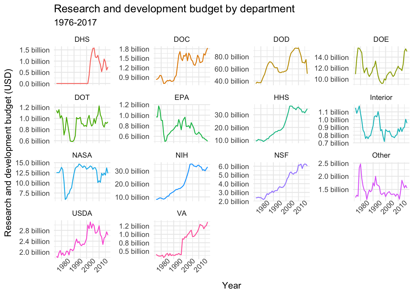
Many models with purrr
Remember, the purpose of this post is to try to learn how to use purrr to create multiple models, not to make the best possible predictions. Therefore, we won’t necessarily follow best practices (like preprocessing the input) or choose the optimal models for this particular problem.
With that disclaimer out of the way, let’s start with a simple linear regression. A linear model is obviously not sufficiently flexible to capture the complexity of the different time-series (although they may give us an idea of general trends), but starting simple is always helpful when learning new stuff.
Nested data sets
In the following chunk we use the nest function to create a new list column. Each element in this list corresponds to a tibble containing the time-series data for a given department.
# Nesting data
nested_data <- data$fed_r_d_spending %>%
  group_by(department) %>%
  nest()

nested_data
## # A tibble: 14 x 2
## department data
## <chr> <list>
## 1 DOD <tibble [42 x 5]>
## 2 NASA <tibble [42 x 5]>
## 3 DOE <tibble [42 x 5]>
## 4 HHS <tibble [42 x 5]>
## 5 NIH <tibble [42 x 5]>
## 6 NSF <tibble [42 x 5]>
## 7 USDA <tibble [42 x 5]>
## 8 Interior <tibble [42 x 5]>
## 9 DOT <tibble [42 x 5]>
## 10 EPA <tibble [42 x 5]>
## 11 DOC <tibble [42 x 5]>
## 12 DHS <tibble [42 x 5]>
## 13 VA <tibble [42 x 5]>
## 14 Other <tibble [42 x 5]>Now we can use map to fit a linear model to each data set in the data column:
# Fitting linear models
nested_models <- nested_data %>%
  mutate(model = map(data, ~ lm(rd_budget ~ year, data = .x)))

nested_models
## # A tibble: 14 x 3
## department data model
## <chr> <list> <list>
## 1 DOD <tibble [42 x 5]> <S3: lm>
## 2 NASA <tibble [42 x 5]> <S3: lm>
## 3 DOE <tibble [42 x 5]> <S3: lm>
## 4 HHS <tibble [42 x 5]> <S3: lm>
## 5 NIH <tibble [42 x 5]> <S3: lm>
## 6 NSF <tibble [42 x 5]> <S3: lm>
## 7 USDA <tibble [42 x 5]> <S3: lm>
## 8 Interior <tibble [42 x 5]> <S3: lm>
## 9 DOT <tibble [42 x 5]> <S3: lm>
## 10 EPA <tibble [42 x 5]> <S3: lm>
## 11 DOC <tibble [42 x 5]> <S3: lm>
## 12 DHS <tibble [42 x 5]> <S3: lm>
## 13 VA <tibble [42 x 5]> <S3: lm>
## 14 Other <tibble [42 x 5]> <S3: lm>The newly created models column contains a separate simple linear regression model fitted to the corresponding data set in the data column. We can extract meaningful information from each model and output the information in a tidy way using broom.
Tidying up with broom
The broom package transforms the output of lm into tidy data frames. For example, we can extract the estimated model parameters and their associated statistics for each department using the tidy function. Setting conf.int = TRUE returns 95 % confidence intervals for the parameter estimates. Alternatively, one could set quick = TRUE to return only the estimated regression coefficients. The aptly named unnest function lets us unpack the contents of a list column and display it as a tidy dataframe:
# Display estimated parameters, associated statistics, confidence intervals
nested_models %>%
  mutate(coefs = map(model, tidy, conf.int = TRUE)) %>%
  unnest(coefs)
## # A tibble: 28 x 8
## department term estimate std.error statistic p.value conf.low
## <chr> <chr> <dbl> <dbl> <dbl> <dbl> <dbl>
## 1 DOD (Int~ -1.93e12 3.13e11 -6.17 2.75e- 7 -2.57e12
## 2 DOD year 1.00e 9 1.57e 8 6.37 1.41e- 7 6.83e 8
## 3 NASA (Int~ -9.01e10 5.86e10 -1.54 1.32e- 1 -2.09e11
## 4 NASA year 5.12e 7 2.94e 7 1.74 8.88e- 2 -8.13e 6
## 5 DOE (Int~ 3.81e10 4.67e10 0.816 4.19e- 1 -5.62e10
## 6 DOE year -1.31e 7 2.34e 7 -0.562 5.78e- 1 -6.04e 7
## 7 HHS (Int~ -1.59e12 9.71e10 -16.4 2.21e-19 -1.79e12
## 8 HHS year 8.10e 8 4.86e 7 16.7 1.36e-19 7.12e 8
## 9 NIH (Int~ -1.55e12 9.23e10 -16.8 9.63e-20 -1.74e12
## 10 NIH year 7.88e 8 4.62e 7 17.1 5.98e-20 6.95e 8
## # ... with 18 more rows, and 1 more variable: conf.high <dbl>We could use these parameter estimates and confidence intervals to plot the different models. In the case of linear regression, however, we can simply use geom_smooth and pass method = "lm" and ggplot will take care of the rest:
# Plotting linear models
data$fed_r_d_spending %>%
  ggplot(aes(year, rd_budget, color = department)) +
  geom_line() +
  geom_smooth(method = "lm", color = "black", lwd = .5) +
  facet_wrap(~department, scales = "free_y", ncol = 4) +
  labs(title = "Simple linear regression", x = "Year", y = "Research and development budget (USD)") +
  scale_y_continuous(labels = scales::unit_format(unit = "billion", scale = 1e-9, accuracy = 0.1)) +
  theme_minimal() +
  theme(legend.position = "none",
        axis.text.x = element_text(angle = 45))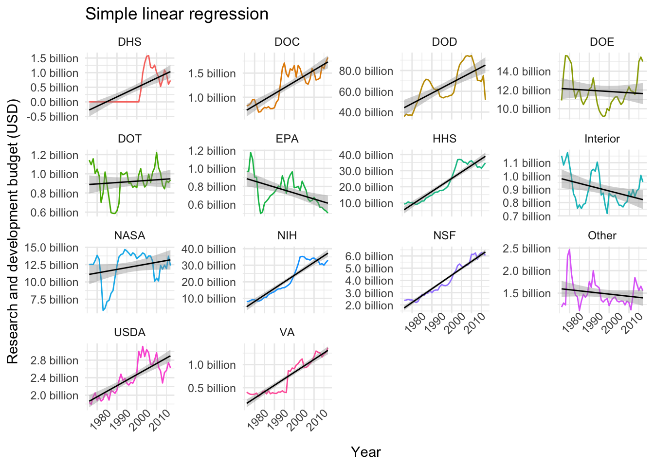
Similarly, we can use the glance function (as described here) to extract different quality metrics for each model. So, for example, we can arrange the models by largest coefficient of determination (R squared):
# Extracting R squared statistic for each model
nested_models %>%
  mutate(metrics = map(model, glance)) %>%
  unnest(metrics) %>%
  select(department:r.squared) %>%
  arrange(desc(r.squared)) # Arranging by "best" R squared
## # A tibble: 14 x 4
## department data model r.squared
## <chr> <list> <list> <dbl>
## 1 NSF <tibble [42 x 5]> <S3: lm> 0.948
## 2 NIH <tibble [42 x 5]> <S3: lm> 0.879
## 3 HHS <tibble [42 x 5]> <S3: lm> 0.874
## 4 VA <tibble [42 x 5]> <S3: lm> 0.860
## 5 DOC <tibble [42 x 5]> <S3: lm> 0.667
## 6 USDA <tibble [42 x 5]> <S3: lm> 0.656
## 7 DHS <tibble [42 x 5]> <S3: lm> 0.545
## 8 DOD <tibble [42 x 5]> <S3: lm> 0.504
## 9 EPA <tibble [42 x 5]> <S3: lm> 0.257
## 10 Interior <tibble [42 x 5]> <S3: lm> 0.145
## 11 NASA <tibble [42 x 5]> <S3: lm> 0.0707
## 12 Other <tibble [42 x 5]> <S3: lm> 0.0422
## 13 DOT <tibble [42 x 5]> <S3: lm> 0.0130
## 14 DOE <tibble [42 x 5]> <S3: lm> 0.00782Modelling with caret
Even though the simple linear model works quite well for some of the departments (e.g. NSF), more complex models will probably do a better job at capturing the wiggliness of our time-series data. In this part I’ll
- Try some different approaches to splitting the data into training and test sets.
- Try to fit a couple of different models from the caret package.
If you’re unfamiliar with the reasoning behind splitting data sets into training and test sets, a good place to start is An Introduction to Statistical Learning (freely available online).
Partitioning the data
In R, one possible approach is to use the rsample package (also by Max Kuhn):
split_nested_data <- nested_data %>%
  mutate(split_data = map(data, initial_split, prop = 0.8, seed = 42),
         training = map(split_data, training),
         test = map(split_data, testing))

split_nested_data
## # A tibble: 14 x 5
## department data split_data training test
## <chr> <list> <list> <list> <list>
## 1 DOD <tibble [42 x ~ <split [34/8]> <tibble [34 x ~ <tibble [8 x ~
## 2 NASA <tibble [42 x ~ <split [34/8]> <tibble [34 x ~ <tibble [8 x ~
## 3 DOE <tibble [42 x ~ <split [34/8]> <tibble [34 x ~ <tibble [8 x ~
## 4 HHS <tibble [42 x ~ <split [34/8]> <tibble [34 x ~ <tibble [8 x ~
## 5 NIH <tibble [42 x ~ <split [34/8]> <tibble [34 x ~ <tibble [8 x ~
## 6 NSF <tibble [42 x ~ <split [34/8]> <tibble [34 x ~ <tibble [8 x ~
## 7 USDA <tibble [42 x ~ <split [34/8]> <tibble [34 x ~ <tibble [8 x ~
## 8 Interior <tibble [42 x ~ <split [34/8]> <tibble [34 x ~ <tibble [8 x ~
## 9 DOT <tibble [42 x ~ <split [34/8]> <tibble [34 x ~ <tibble [8 x ~
## 10 EPA <tibble [42 x ~ <split [34/8]> <tibble [34 x ~ <tibble [8 x ~
## 11 DOC <tibble [42 x ~ <split [34/8]> <tibble [34 x ~ <tibble [8 x ~
## 12 DHS <tibble [42 x ~ <split [34/8]> <tibble [34 x ~ <tibble [8 x ~
## 13 VA <tibble [42 x ~ <split [34/8]> <tibble [34 x ~ <tibble [8 x ~
## 14 Other <tibble [42 x ~ <split [34/8]> <tibble [34 x ~ <tibble [8 x ~I really like this approach. We set the proportion (prop = 0.8) of data that we want to retain in the training set and apply the initial_split function to create a new column called split_data. Next, we map the training and testing functions to split_data, and hey presto, we have 14 different training and test sets.
However, when forecasting, it may be more appropriate to use the most recent observations as a test set instead of a randomly sampled subset of data points. This can be accomplished by defining our own function split_data. In this example I hard code the time intervals, but it is fairly straightforward to generalise the function.
# Custom data splitter
split_data <- function(df, data) {

  # Check that arguments are valid
  if (!data %in% c("training", "test")) {
    stop("Argument data needs to be one of 'training' or 'test'")
  }

  # Split data into training or test set
  if (data == "training") {
    return(filter(df, year %in% c(1976:2012)))
  } else if (data == "test") {
    return(filter(df, year %in% c(2013:2017)))
  }
}

split_nested_data <- nested_data %>%
  mutate(training = map(data, split_data, data = "training"),
         test = map(data, split_data, data = "test"))

split_nested_data
## # A tibble: 14 x 4
## department data training test
## <chr> <list> <list> <list>
## 1 DOD <tibble [42 x 5]> <tibble [37 x 5]> <tibble [5 x 5]>
## 2 NASA <tibble [42 x 5]> <tibble [37 x 5]> <tibble [5 x 5]>
## 3 DOE <tibble [42 x 5]> <tibble [37 x 5]> <tibble [5 x 5]>
## 4 HHS <tibble [42 x 5]> <tibble [37 x 5]> <tibble [5 x 5]>
## 5 NIH <tibble [42 x 5]> <tibble [37 x 5]> <tibble [5 x 5]>
## 6 NSF <tibble [42 x 5]> <tibble [37 x 5]> <tibble [5 x 5]>
## 7 USDA <tibble [42 x 5]> <tibble [37 x 5]> <tibble [5 x 5]>
## 8 Interior <tibble [42 x 5]> <tibble [37 x 5]> <tibble [5 x 5]>
## 9 DOT <tibble [42 x 5]> <tibble [37 x 5]> <tibble [5 x 5]>
## 10 EPA <tibble [42 x 5]> <tibble [37 x 5]> <tibble [5 x 5]>
## 11 DOC <tibble [42 x 5]> <tibble [37 x 5]> <tibble [5 x 5]>
## 12 DHS <tibble [42 x 5]> <tibble [37 x 5]> <tibble [5 x 5]>
## 13 VA <tibble [42 x 5]> <tibble [37 x 5]> <tibble [5 x 5]>
## 14 Other <tibble [42 x 5]> <tibble [37 x 5]> <tibble [5 x 5]>(Note that we can pass arguments to .f in map.)
Resampling with trainControl
Yet another approach is to move the training and test sets in time. This can be achieved by using the trainControl function in caret, which specifies the resampling method to be used when fitting a model with the train function (please refer to the caret docs for details).
In our case, we set method = "timeslice" to perform so-called rolling forecasting origin resampling. Check out the illuminating illustration in chapter 4.3 of the caret documentation to get a sense of what’s happening.
Fitting models
First, let’s define a train_model function that takes care of both the resampling and training. Next, let’s fit two highly flexible models to the data: a Gaussian process and a generalised additive model (with splines).
# Training function
train_model <- function(df, method) {
  # Rolling forecasting origin resampling
  train_control <- trainControl(method = "timeslice",
                              initialWindow = 5,
                              horizon = 5,
                              fixedWindow = FALSE)

  # Training
  train(rd_budget ~ year, data = df,
        method = method, # Method indicates which model to use, see ch. 7 in caret docs
        trControl = train_control) # Resampling method
}

nested_models <- nested_data %>%
  mutate(gp_models = map(data, train_model, method = "gaussprRadial"), # Gaussian process model
         gam_models = map(data, train_model, method = "gam")) # Generalised additive model (with splines)

nested_models
## # A tibble: 14 x 4
## department data gp_models gam_models
## <chr> <list> <list> <list>
## 1 DOD <tibble [42 x 5]> <S3: train> <S3: train>
## 2 NASA <tibble [42 x 5]> <S3: train> <S3: train>
## 3 DOE <tibble [42 x 5]> <S3: train> <S3: train>
## 4 HHS <tibble [42 x 5]> <S3: train> <S3: train>
## 5 NIH <tibble [42 x 5]> <S3: train> <S3: train>
## 6 NSF <tibble [42 x 5]> <S3: train> <S3: train>
## 7 USDA <tibble [42 x 5]> <S3: train> <S3: train>
## 8 Interior <tibble [42 x 5]> <S3: train> <S3: train>
## 9 DOT <tibble [42 x 5]> <S3: train> <S3: train>
## 10 EPA <tibble [42 x 5]> <S3: train> <S3: train>
## 11 DOC <tibble [42 x 5]> <S3: train> <S3: train>
## 12 DHS <tibble [42 x 5]> <S3: train> <S3: train>
## 13 VA <tibble [42 x 5]> <S3: train> <S3: train>
## 14 Other <tibble [42 x 5]> <S3: train> <S3: train>The following function lets us plot the results.
plot_models <- function(df, variable, title) {

  model <- enquo(variable)

  df %>%
    mutate(preds = map(!!model, predict.train)) %>%
    unnest(data, preds) %>%
    ggplot(aes(x = year, color = department)) +
    geom_line(aes(y = rd_budget)) +
    geom_line(aes(y = preds), color = "black", alpha = .7) +
    facet_wrap(~department, scales = "free_y", ncol = 4) +
    labs(title = title, x = "Year", y = "Research and development budget (USD)") +
    scale_y_continuous(labels = scales::unit_format(unit = "billion", scale = 1e-9, accuracy = 0.1)) +
    theme_minimal() +
    theme(legend.position = "none",
          axis.text.x = element_text(angle = 45))
}

plot_models(nested_models, gam_models, "Generalised additive models")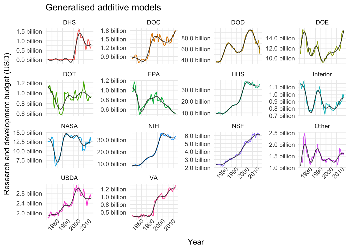
plot_models(nested_models, gp_models, "Gaussian processes")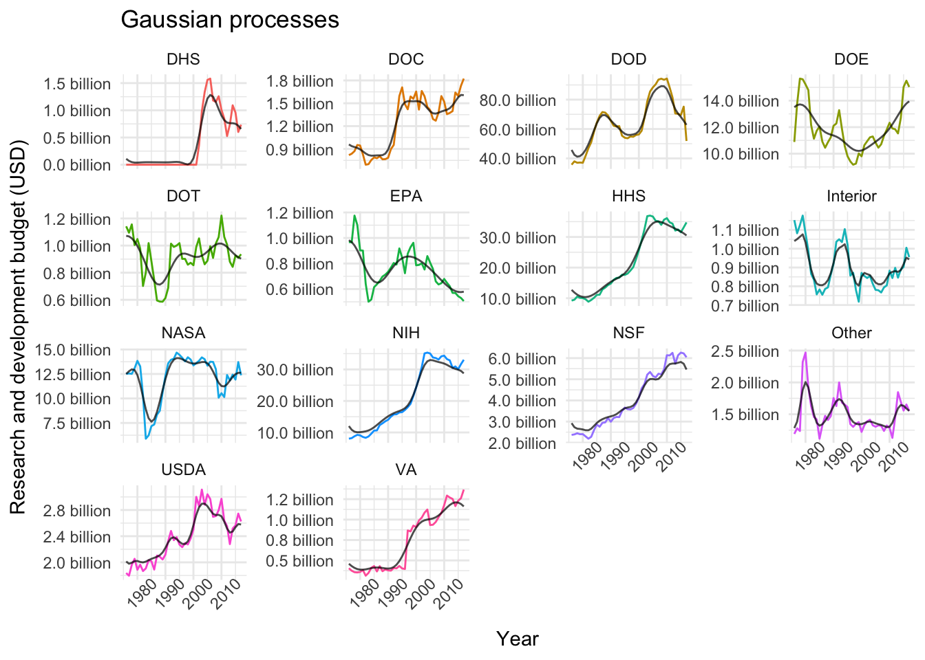
Evaluation
One way to evaluate our models is to use the resamples function in caret. I’m not entirely convinced that this is an appropriate strategy for time-series data, but I’ll include the following chunk nonetheless because it may be useful in a future project. Furthermore, we get to use a new function from purrr: map2, which iterates over multiple inputs simultaneously.
# Helper functions to create and save evaluation plots
plot_rsquared <- function(name, df) {
  scales <- list(x = list(relation = "free"), y = list(relation = "free"))
  bwplot(df, scales = scales, main = name)
}

save_img <- function(name, img) {
  trellis.device(device = "png", filename = paste0(name, ".png"))
  print(img)
  dev.off()
}

# Gather results and create plots
imgs_df <- nested_models %>%
  mutate(model_pairs = map2(gp_models, gam_models, ~list(GP = .x, GAM = .y)),
         results = map(model_pairs, resamples),
         imgs = map2(department, results, plot_rsquared))

# Save images to disk
map2(imgs_df$department, imgs_df$imgs, save_img)
In the chunk above, the map2 call produces a plot using lattice which summarises the mean absolute error (MAE), the root mean squared error (RMSE) and the coefficient of determination on the resampled data, like this:

That’s it for this week’s (rather lengthy, sorry) post! Hope you enjoyed it, I certainly did. Please hit me up on twitter if you have any feedback or suggestions. Thanks for reading!