This week’s #tidytuesday data is the incarceration trends data set from the Vera Institute of Justice, which contains county-level jail data (1970-2015) and prison data (1983-2015). Vera is a non-profit research and policy organisation focusing on “the causes and consequences of mass incarceration, racial disparities, and the loss of public trust in law enforcement” (see the Wikipedia article for more).
I’ve been thinking about exploring maps in R but never gotten around to it, so this seemed like a great opportunity. I ended up checking out the following alternatives:
- ggmap: a package that leverages mapping services like Google Maps to obtain map tiles.
- tmap: a library for drawing thematic maps, with an API similar to
ggplot2. - tigris: allows users to directly download and use TIGER/Line shapefiles from the US Census Bureau.
- urbnmapr: a package providing state and county shapefiles that are compatible with
ggplot2.
Ultimately, I found myself spending way too much time reading documentation instead of plotting interesting stuff, and was almost about to abandon the entire project for this week. Thankfully David Robinson’s #tinytuesday screencast (once again) came to the rescue.
It turns out that ggplot2 comes with a handy function that leverages data from the maps package (which I was unaware of) and makes it suitable for plotting. Let’s load the relevant packages and show an example.
Plotting maps with ggplot2
# Loading useful packages
library(tidyverse)
library(gganimate)
library(maps)
library(knitr)
library(kableExtra)

# Loading data from GitHub
raw_data <- read_csv("https://raw.githubusercontent.com/rfordatascience/tidytuesday/master/data/2019/2019-01-22/prison_population.csv")
Let’s plot a map of the contiguous United States:
map_data("usa") %>%
  tbl_df() %>%
  ggplot(aes(x = long, y = lat, group = group)) +
  geom_polygon() +
  coord_map()
What map_data essentially does is that it returns a dataframe consisting of a series of points (longitudes and latitudes) which are grouped together. The grouping tells the geom_polygon layer which dots to connect in order to get an outline of the US. To include the states, we simply pass "state" as an argument…
map_data("state") %>%
  tbl_df() %>%
  ggplot(aes(x = long, y = lat, group = group)) +
  geom_polygon() +
  coord_map()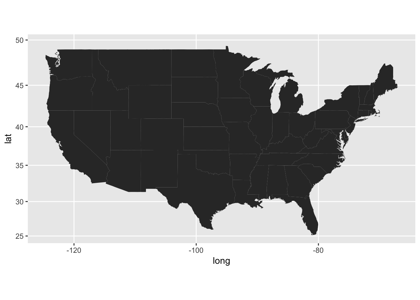
… and likewise with counties:
map_data("county") %>%
  tbl_df() %>%
  ggplot(aes(x = long, y = lat, group = group)) +
  geom_polygon() +
  coord_map()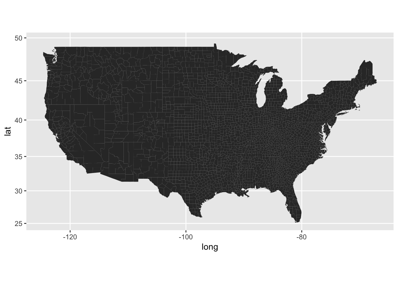
There are of course other maps available (see the documentation for more info). Also, if you’re interested in some more details about how map_data works, please check out this excellent guide.
Visualising missing data
While I was (unsuccessfully) experimenting with tmap, it became clear that plotting maps wasn’t my only challenge this week. The data has a lot of missing values:
# Checking which columns have missing values
raw_data %>%
  summarise_all(funs(sum(is.na(.)))) %>%
  select_if(function(x) x > 0) %>%
  kable() %>%
kable_styling(bootstrap_options = c("striped", "condensed"))| population | prison_population |
|---|---|
| 273093 | 751787 |
In fact, over half the rows have missing values for prison populations. This is clearly a problem, and may require a significant amount of time to deal with (David briefly describes techniques for dealing with missing data that I found quite useful).
Instead of dealing with the intricacies associated with addressing the missing values problem, I decided to turn the problem on its head and visualise them as a function of time. First I calculated the percentage of missing values for each state in every year:
state_missing_data <- raw_data %>%
  filter(pop_category == "Total") %>%
  group_by(year, state) %>%
  summarise(missing_data = round(100*mean(is.na(prison_population)), 2)) %>%
  ungroup()
We can take a closer look at e.g. Texas to get an idea of what the results of the previous chunk are:
state_missing_data %>%
  filter(state == "TX") %>%
  kable() %>%
kable_styling(bootstrap_options = c("striped", "condensed"))| year | state | missing_data |
|---|---|---|
| 1970 | TX | 100.00 |
| 1971 | TX | 100.00 |
| 1972 | TX | 100.00 |
| 1973 | TX | 100.00 |
| 1974 | TX | 100.00 |
| 1975 | TX | 100.00 |
| 1976 | TX | 100.00 |
| 1977 | TX | 100.00 |
| 1978 | TX | 100.00 |
| 1979 | TX | 100.00 |
| 1980 | TX | 100.00 |
| 1981 | TX | 100.00 |
| 1982 | TX | 100.00 |
| 1983 | TX | 8.27 |
| 1984 | TX | 6.69 |
| 1985 | TX | 5.51 |
| 1986 | TX | 4.33 |
| 1987 | TX | 3.54 |
| 1988 | TX | 5.91 |
| 1989 | TX | 4.72 |
| 1990 | TX | 5.91 |
| 1991 | TX | 5.91 |
| 1992 | TX | 5.12 |
| 1993 | TX | 4.72 |
| 1994 | TX | 4.72 |
| 1995 | TX | 3.15 |
| 1996 | TX | 85.04 |
| 1997 | TX | 85.04 |
| 1998 | TX | 64.57 |
| 1999 | TX | 85.04 |
| 2000 | TX | 85.04 |
| 2001 | TX | 64.57 |
| 2002 | TX | 85.04 |
| 2003 | TX | 85.04 |
| 2004 | TX | 2.36 |
| 2005 | TX | 2.36 |
| 2006 | TX | 2.76 |
| 2007 | TX | 2.36 |
| 2008 | TX | 1.57 |
| 2009 | TX | 2.76 |
| 2010 | TX | 2.36 |
| 2011 | TX | 1.57 |
| 2012 | TX | 1.57 |
| 2013 | TX | 1.18 |
| 2014 | TX | 0.79 |
| 2015 | TX | 1.18 |
| 2016 | TX | 100.00 |
There are no values for the prison population in Texas until 1983. Following this there is a relatively stable period with much more data, until 1996. From then on there is a dramatic increase in the amount of missing data, which lasts until 2003. Then things look quite good for a while, until we reach the last year of the data set for which there are no recorded values for the prison population.
Next, I used gganimate to visualise the percentage of missing values for each state by year:
state_missing_data %>%
  mutate(region = str_to_lower(state.name[match(state, state.abb)])) %>% # Cool trick!
  right_join(map_data("state"), by = "region") %>%
  ggplot(aes(x = long, y = lat, group = group, fill = missing_data)) +
  geom_polygon() +
  ggthemes::theme_map() +
  coord_map() +
  scale_fill_viridis_c(guide = guide_legend(title = "Percent")) +
  transition_manual(year) +
  labs(title = "Percentage of counties with missing data (per state)",
       subtitle = "Year: {current_frame}") +
  theme(legend.position = "right",
        plot.title = element_text(hjust = 0.5, face = "bold"),
        plot.subtitle = element_text(hjust = 0.5))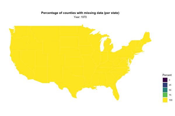
Note the cool little trick I picked up (once again) from David’s screencast: In order to join our prison data with the map data, David makes clever use of the function match and the base R dataset state. Try it out for yourself to see how it works!
That’s it for this week’s’ #tidytuesday. Thanks for reading!